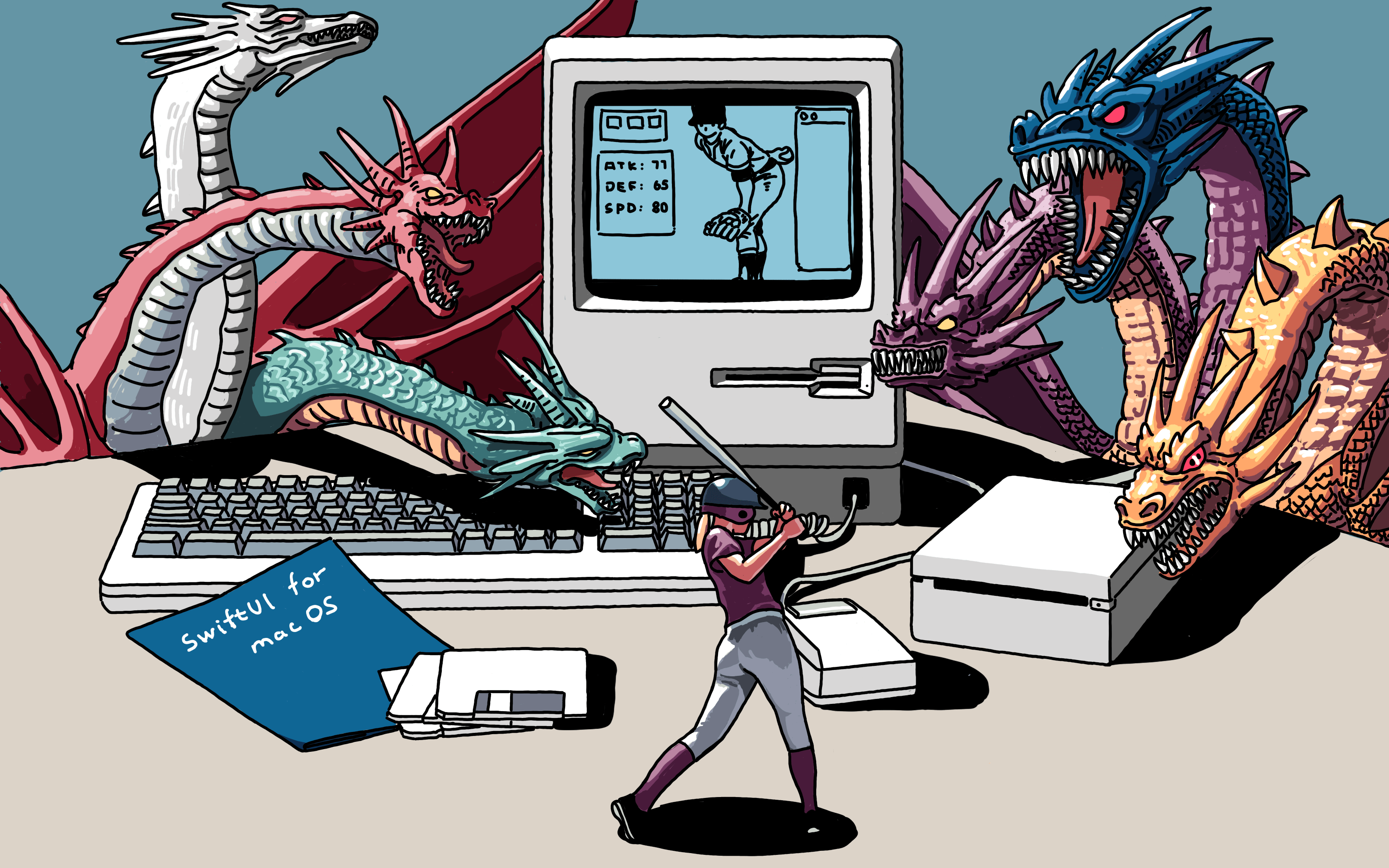
受 Apple 加速器 SwiftUI 活动邀请,做了个分享,还和喵神、61、浙剑、思琪等社区大神参与了圆桌讨论。这次完善了 SwiftUI 做的幻灯片,比去年要好一点,增加了解释执行代码交互功能。
为这次幻灯画了几张图,在新西兰认识的画家,指导我了些画法,用其完成了幻灯里的图。
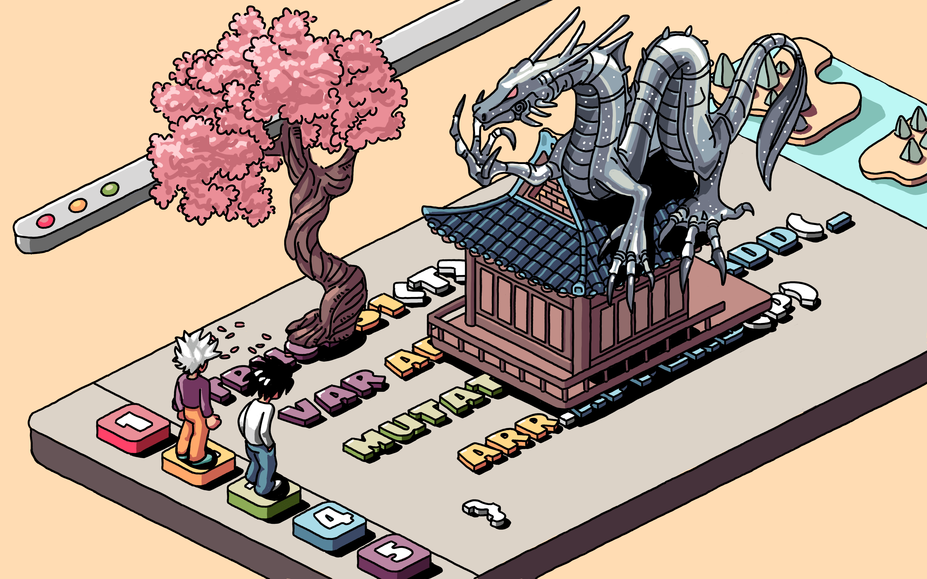
macOS 多栏
内容有 macOS 多栏、Toolbar、文件夹嵌套、文本和代码编辑器、网格视图和斜45度视觉。
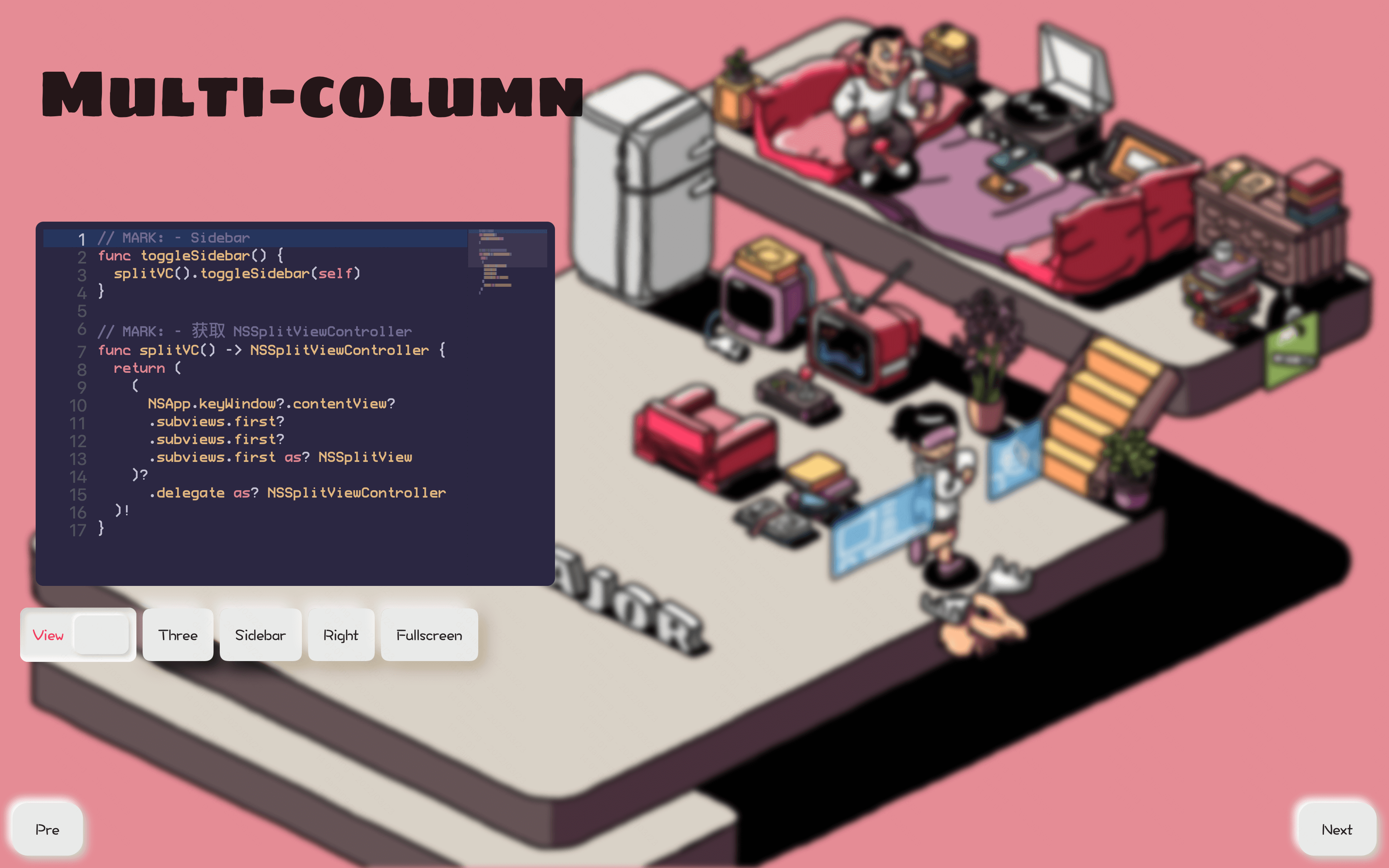
macOS 的多栏只需要使用 NavigationView 就可以了,闭包里的第一个视图就是 Sidebar,后面的视图可以作为占位视图,显示一些初始信息,通过 Sidebar 的 NavigationLink 来设置第二栏的视图就好了,第三栏通过第二栏来指定。
如果想要隐藏收起 Sidebar 需要先获取 SplitViewController,然后调用 toggleSidebar 方法就可以了。如果想要收起最右侧视图或任意一栏视图,可以在 SplitViewController 的 splitViewItems 里找到对应的 Item,比如最右一栏就是 splitViewItems.last。调用找到视图的 animator().isCollapsed.toggle() 就可以了。
如果只想让其中一栏全屏显示,先在 splitViewItems 找到那一栏,然后调用对应 ViewController 里 View 的 enterFullScreenMode 方法,要注意的是,设置的 Options 需要包含 .autoHideDock 和 .autoHideMenuBar,否则就没法退出全屏了。由于全屏后会将视图放到另一个 Window 中,因此退出全屏可以直接调用当前 key window 的 contentView 的 exitFullScreenMode() 方法。
Toolbar
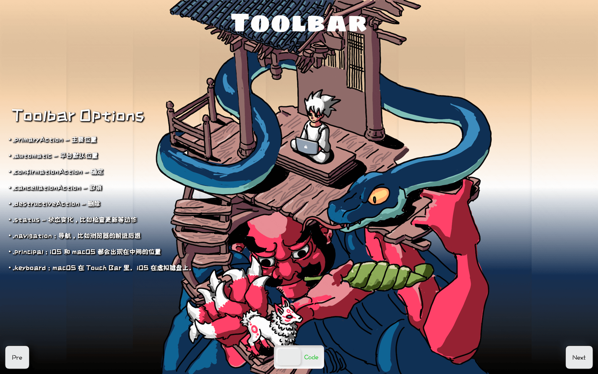
一般的 macOS 程序多栏顶部会有一些功能按钮,以方便用户了解到程序的主要高频功能,比如 Xcode 的调试和 Target 选择按钮,Keynote 的播放、添加幻灯片、缩放文本、形状、表格、图表等按钮。这些按钮都可以通过 Toolbar 来实现。Toolbar 根据摆放位置和语义设置了一组 Options,通过 Options 统一了多平台的表现形式,比如默认位置的 option 就是 .automatic,中间位置就是 .principal,macOS Touch Bar iOS 的虚拟键盘上的按钮用的就是 .keyboard。另外还有很多语义表示,用于放置到不同平台特定的位置,比如用于导航的按钮在 macOS 上会出现在最左侧,用的就是 .navigation 这种语义的 Options。
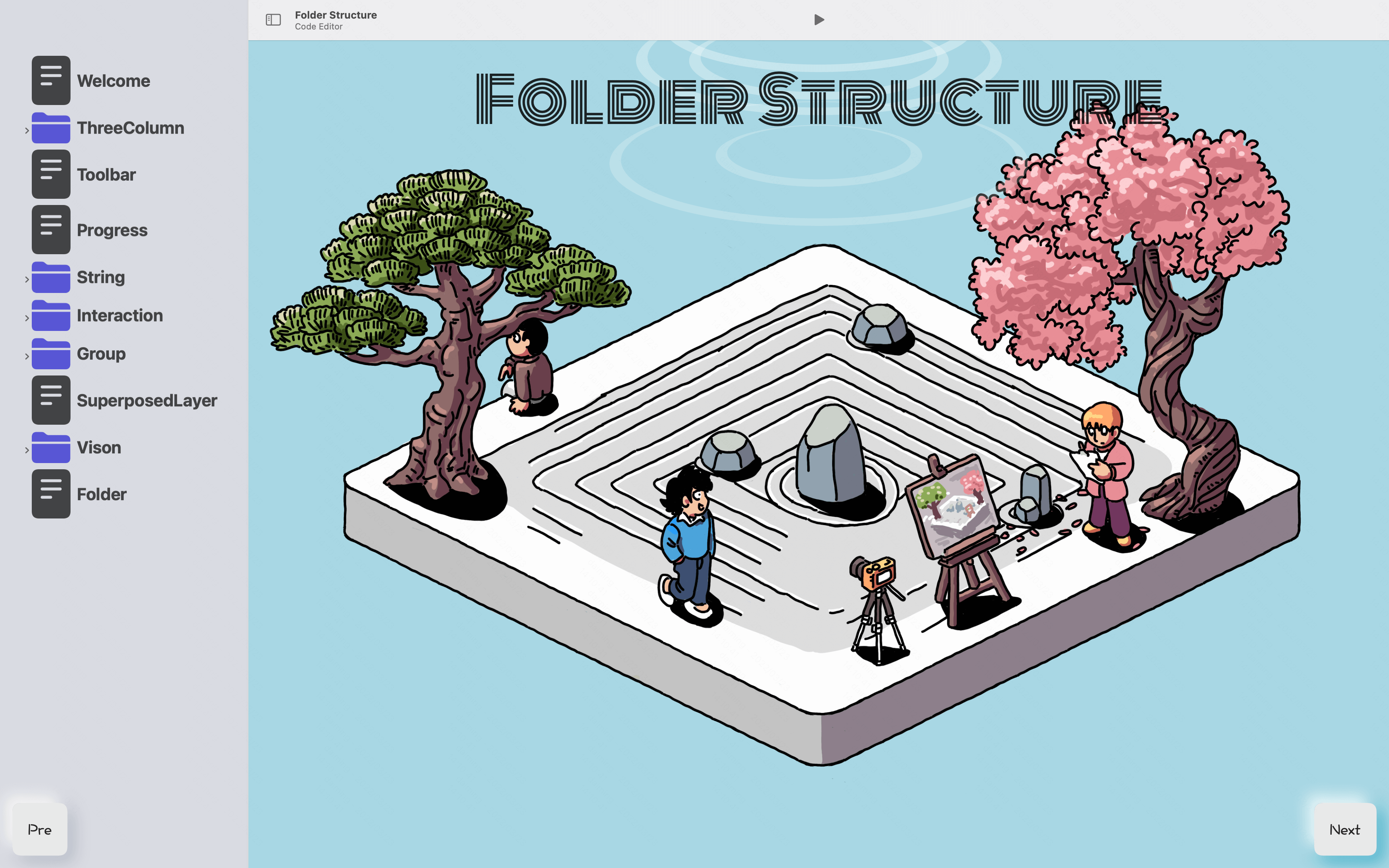
文件夹嵌套结构
得益于 keypaths 在 SwiftUI 中的应用,文件夹嵌套结构实现起来简单了太多。给 List 的 children 参数指定嵌套模型的嵌套键值路径即可,比如模型结构如下:
// MARK: - 目录结构数据模型
struct POM: Hashable, Identifiable {
  var id = UUID()
  var s: String // 文字
  var i: String // 图标
  var sub: [POM] ?
}
其中嵌套键值是 sub,那么 children 参数只需要添上 \.sub ,List 内部会处理嵌套逻辑并展示出来。如果 List 表现出来的效果并不能够满足你,你也可以自己定制视图和交互。比如点击文件夹名字也能够展开子内容,List 默认只有点击左侧箭头才能够展开。
自定义嵌套视图底层可以使用 DisclosureGroup,DisclosureGroup 能够展示自定义视图内容,还有一个 isExpanded 值绑定参数用来显示和隐藏内容。在遍历已展示视图时,通过 keypaths 发现嵌套值不为空时就读取子内容,同时默认 isExpanded 值为 false 就会显示不展开的箭头符号,将文件夹名字做成按钮,点击按钮触发 isExpanded.toggle(),如 isExpanded 为 false 就置为 true,即展开文件夹,反之就会收起文件夹。
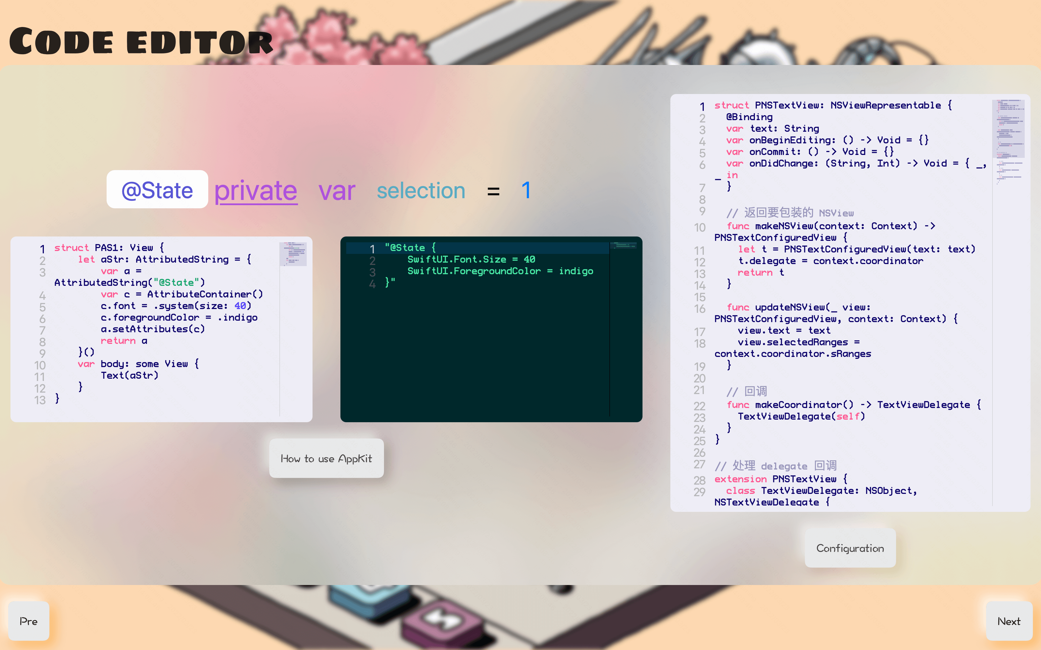
文本和代码编辑器
文本和代码编辑器也是 macOS 上很常见的效率工具的核心功能,包含的技术点较多,比如调试和代码分析会用到编译器这里就不展开说了。感兴趣可以参看深入剖析 iOS 编译 Clang / LLVM、深入剖析 iOS 编译 Clang / LLVM 直播的 Slides、atSwift大会上分享《学习iOS编译原理能做哪些有意思的事情》的 Slides、这次swift大会分享准备的幻灯片和 demo,这几篇。
文本或代码分析完后可以通过 Attribute 来进行富文本展示的设置,富文本属性都在 AttributeContainer 中设置,设置好的富文本直接通过 append 进行组合。编辑器其它的比如编辑、重做、存储或自定义的能力可以通过 NSViewRepresentable 来包装 Appkit 直接使用 Appkit 里的 NSTextView 的能力。
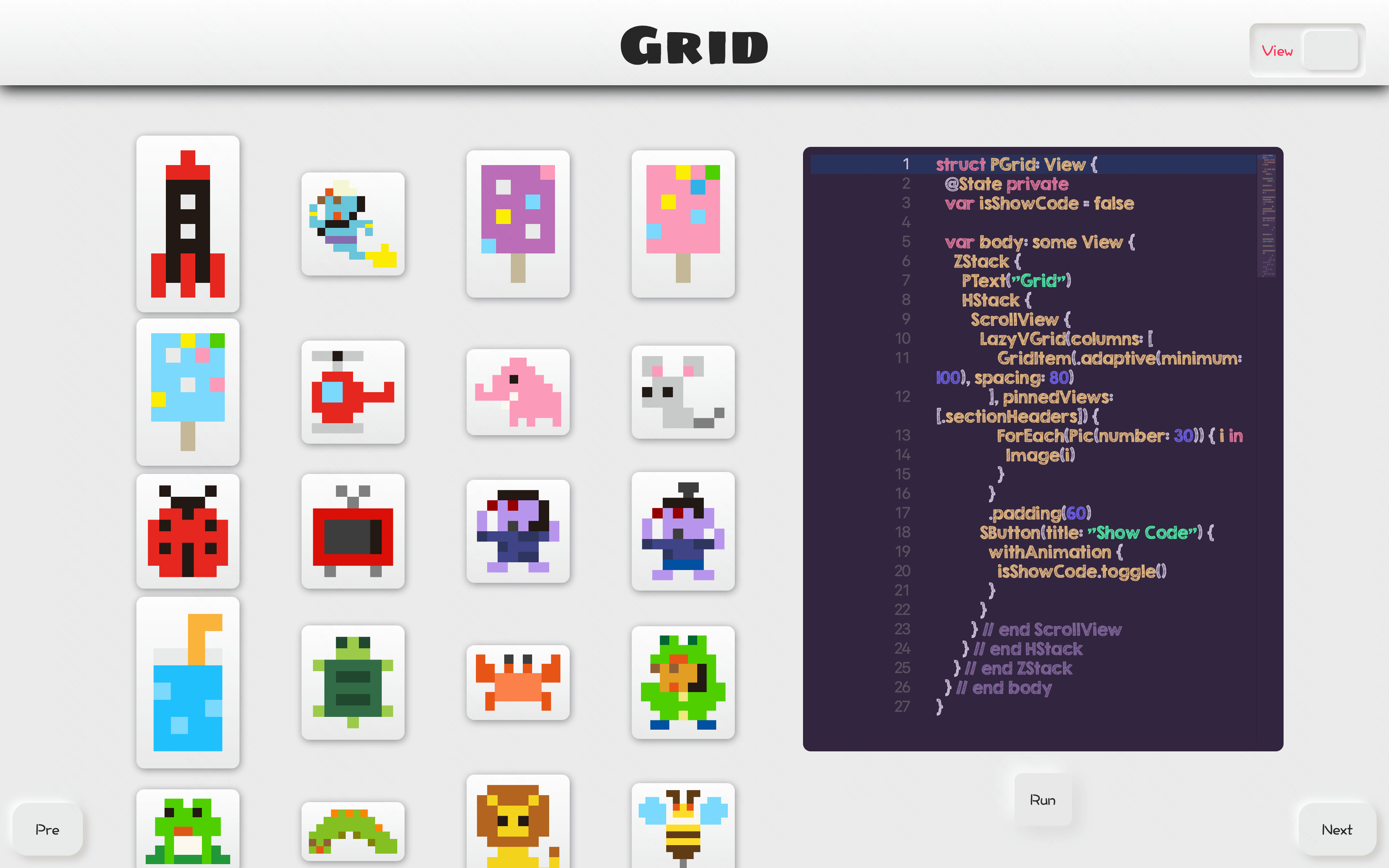
Grid
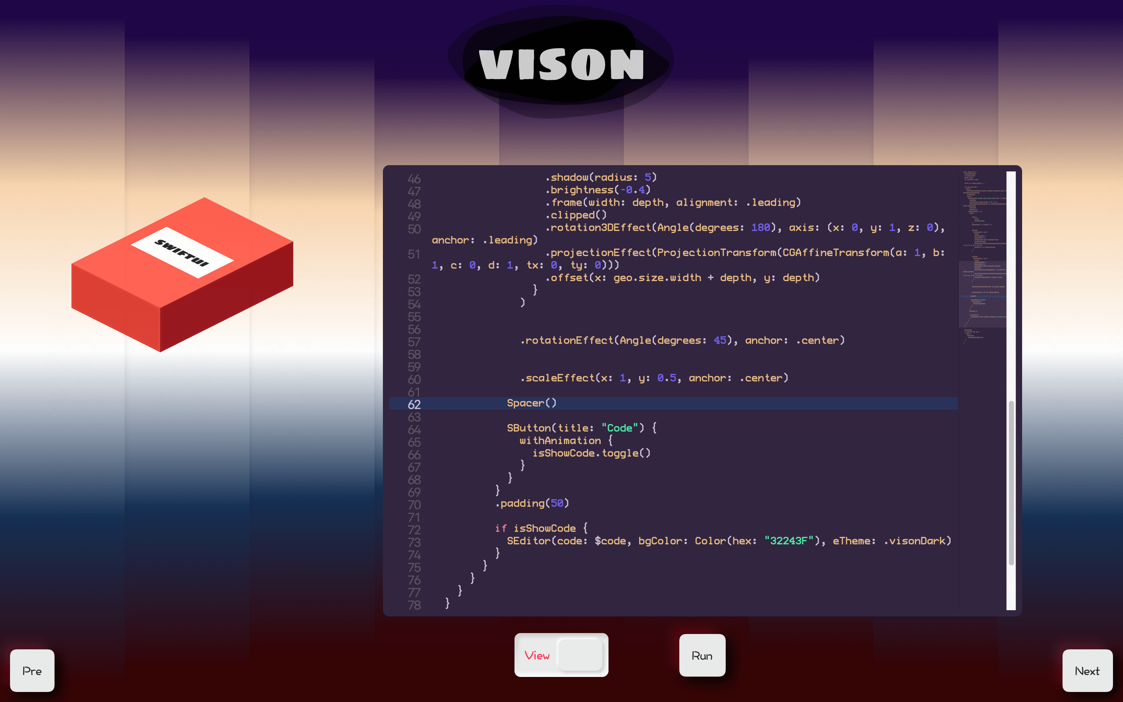
Vision
接下来详细的说下 SwiftUI 的视图组件的使用,这次的幻灯片程序用到的技术,除了解释执行代码的功能,其它基本都来自下面的内容。
已更新 WWDC22 内容。
SwiftUI 组件
视图组件使用
SwiftUI 对标的 UIKit 视图
如下:
| SwiftUI | UIKit |
|---|---|
| Text 和 Label | UILabel |
| TextField | UITextField |
| TextEditor | UITextView |
| Button 和 Link | UIButton |
| Image | UIImageView |
| NavigationView | UINavigationController 和 UISplitViewController |
| ToolbarItem | UINavigationItem |
| ScrollView | UIScrollView |
| List | UITableView |
| LazyVGrid 和 LazyHGrid | UICollectionView |
| HStack 和 LazyHStack | UIStack |
| VStack 和 LazyVStack | UIStack |
| TabView | UITabBarController 和 UIPageViewController |
| Toggle | UISwitch |
| Slider | UISlider |
| Stepper | UIStepper |
| ProgressView | UIProgressView 和 UIActivityIndicatorView |
| Picker | UISegmentedControl |
| DatePicker | UIDatePicker |
| Alert | UIAlertController |
| ActionSheet | UIAlertController |
| Map | MapKit |
Text
基本用法
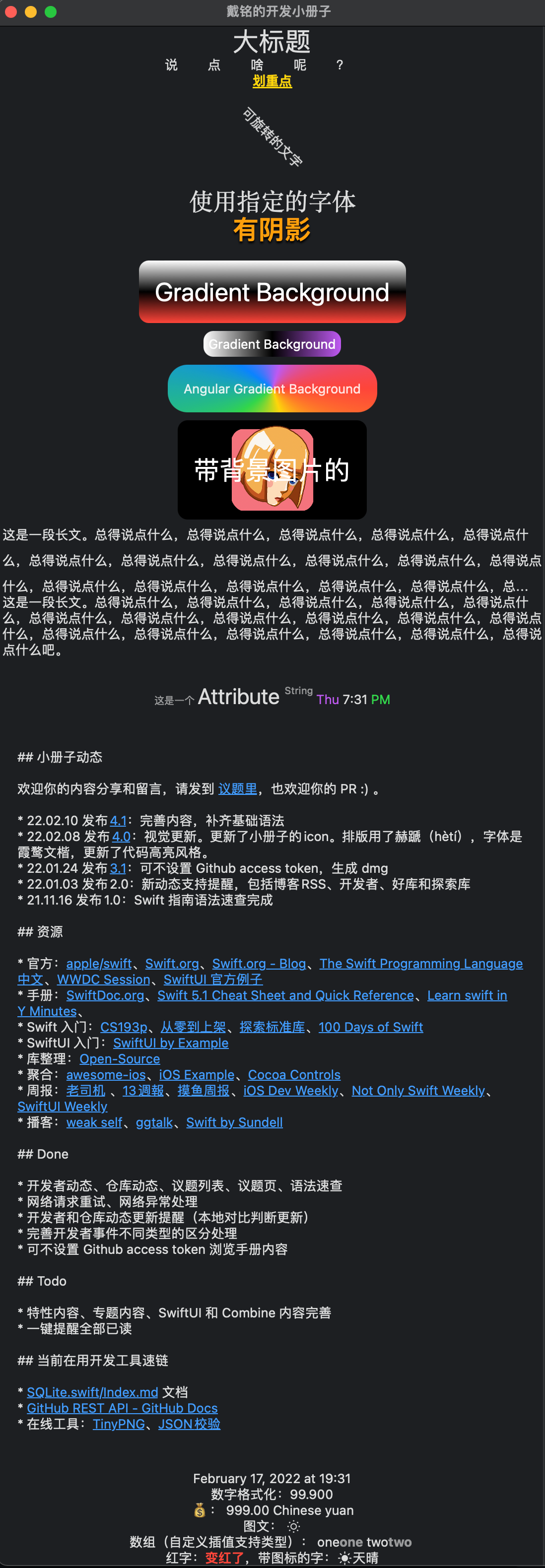
// MARK: - Text
struct PlayTextView: View {
    let manyString = "这是一段长文。总得说点什么,总得说点什么,总得说点什么,总得说点什么,总得说点什么,总得说点什么,总得说点什么,总得说点什么,总得说点什么,总得说点什么,总得说点什么,总得说点什么,总得说点什么,总得说点什么,总得说点什么,总得说点什么,总得说点什么吧。"
    var body: some View {
        ScrollView {
            Group {
                Text("大标题").font(.largeTitle)
                Text("说点啥呢?")
                    .tracking(30) // 字间距
                    .kerning(30) // 尾部留白
                Text("划重点")
                    .underline()
                    .foregroundColor(.yellow)
                    .fontWeight(.heavy)
                Text("可旋转的文字")
                    .rotationEffect(.degrees(45))
                    .fixedSize()
                    .frame(width: 20, height: 80)
                Text("自定义系统字体大小")
                    .font(.system(size: 30))
                Text("使用指定的字体")
                    .font(.custom("Georgia", size: 24))
            }
            Group {
                Text("有阴影")
                    .font(.largeTitle)
                    .foregroundColor(.orange)
                    .bold()
                    .italic()
                    .shadow(color: .black, radius: 1, x: 0, y: 2)
                Text("Gradient Background")
                    .font(.largeTitle)
                    .padding()
                    .foregroundColor(.white)
                    .background(LinearGradient(gradient: Gradient(colors: [.white, .black, .red]), startPoint: .top, endPoint: .bottom))
                    .cornerRadius(10)
                Text("Gradient Background")
                    .padding(5)
                    .foregroundColor(.white)
                    .background(LinearGradient(gradient: Gradient(colors: [.white, .black, .purple]), startPoint: .leading, endPoint: .trailing))
                    .cornerRadius(10)
                ZStack {
                    Text("渐变透明材质风格")
                        .padding()
                        .background(
                            .regularMaterial,
                            in: RoundedRectangle(cornerRadius: 10, style: .continuous)
                        )
                        .shadow(radius: 10)
                        .padding()
                        .font(.largeTitle.weight(.black))
                }
                .frame(width: 300, height: 200)
                .background(
                    LinearGradient(colors: [.yellow, .pink], startPoint: .topLeading, endPoint: .bottomTrailing)
                )
                Text("Angular Gradient Background")
                    .padding()
                    .background(AngularGradient(colors: [.red, .yellow, .green, .blue, .purple, .red], center: .center))
                    .cornerRadius(20)
                Text("带背景图片的")
                    .padding()
                    .font(.largeTitle)
                    .foregroundColor(.white)
                    .background {
                        Rectangle()
                            .fill(Color(.black))
                            .cornerRadius(10)
                        Image("logo")
                            .resizable()
                            .frame(width: 100, height: 100)
                    }
                    .frame(width: 200, height: 100)
            }

            Group {
                // 设置 lineLimit 表示最多支持行数,依据情况依然有会被减少显示行数
                Text(manyString)
                    .lineLimit(3) // 对行的限制,如果多余设定行数,尾部会显示...
                    .lineSpacing(10) // 行间距
                    .multilineTextAlignment(.leading) // 对齐

                // 使用 fixedSize 就可以在任何时候完整显示
                Text(manyString)
                    .fixedSize(horizontal: false, vertical: true)

            }

            // 使用 AttributeString
            PTextViewAttribute()
                .padding()

            // 使用 Markdown
            PTextViewMarkdown()
                .padding()

            // 时间
            PTextViewDate()

            // 插值
            PTextViewInterpolation()
        }

    }
}
font 字体设置的样式对应 weight 和 size 可以在官方交互文档中查看 Typography
markdown 使用
// MARK: - Markdown
struct PTextViewMarkdown: View {
    let mdaStr: AttributedString = {

        var mda = AttributedString(localized: "这是一个 **Attribute** ~string~")

        /// 自定义的属性语法是^[string](key:value)
        mda = AttributedString(localized: "^[这是](p2:'one')^[一](p3:{k1:1,k2:2})个 **Attribute** ~string~", including: \.newScope)
        print(mda)
        /// 这是 {
        ///     NSLanguage = en
        ///     p2 = one
        /// }
        /// 一 {
        ///     NSLanguage = en
        ///     p3 = P3(k1: 1, k2: 2)
        /// }
        /// 个  {
        ///     NSLanguage = en
        /// }
        /// Attribute {
        ///     NSLanguage = en
        ///     NSInlinePresentationIntent = NSInlinePresentationIntent(rawValue: 2)
        /// }
        ///   {
        ///     NSLanguage = en
        /// }
        /// string {
        ///     NSInlinePresentationIntent = NSInlinePresentationIntent(rawValue: 32)
        ///     NSLanguage = en
        /// }

        // 从文件中读取 Markdown 内容
        let mdUrl = Bundle.main.url(forResource: "1", withExtension: "md")!
        mda = try! AttributedString(contentsOf: mdUrl,options: AttributedString.MarkdownParsingOptions(interpretedSyntax: .inlineOnlyPreservingWhitespace), baseURL: nil) // .inlineOnlyPreservingWhitespace 支持 markdown 文件的换行

        // Markdown 已转换成 AtrributedString 结构。
        for r in mda.runs {
            if let ipi = r.inlinePresentationIntent {
                switch ipi {
                case .lineBreak:
                    print("paragrahp")
                case .code:
                    print("this is code")
                default:
                    break
                }
            }
            if let pi = r.presentationIntent {
                for c in pi.components {
                    switch c.kind {
                    case .paragraph:
                        print("this is paragraph")
                    case .codeBlock(let lang):
                        print("this is \(lang ?? "") code")
                    case .header(let level):
                        print("this is \(level) level")
                    default:
                        break
                    }
                }
            }
        }

        return mda
    }()
    var body: some View {
        Text(mdaStr)
    }
}
AttributedString 的使用
// MARK: - AttributedString
struct PTextViewAttribute: View {
    let aStr: AttributedString = {
        var a1 = AttributedString("这是一个 ")
        var c1 = AttributeContainer()
        c1.font = .footnote
        c1.foregroundColor = .secondary
        a1.setAttributes(c1)

        var a2 = AttributedString("Attribute ")
        var c2 = AttributeContainer()
        c2.font = .title
        a2.setAttributes(c2)

        var a3 = AttributedString("String ")
        var c3 = AttributeContainer()
        c3.baselineOffset = 10
        c3.appKit.foregroundColor = .yellow // 仅在 macOS 里显示的颜色
        c3.swiftUI.foregroundColor = .secondary
        c3.font = .footnote
        a3.setAttributes(c3)
        // a3 使用自定义属性
        a3.p1 = "This is a custom property."

        // formatter 的支持
        var a4 = Date.now.formatted(.dateTime
                                        .hour()
                                        .minute()
                                        .weekday()
                                        .attributed
        )

        let c4AMPM = AttributeContainer().dateField(.amPM)
        let c4AMPMColor = AttributeContainer().foregroundColor(.green)

        a4.replaceAttributes(c4AMPM, with: c4AMPMColor)
        let c4Week = AttributeContainer().dateField(.weekday)
        let c4WeekColor = AttributeContainer().foregroundColor(.purple)
        a4.replaceAttributes(c4Week, with: c4WeekColor)

        a1.append(a2)
        a1.append(a3)
        a1.append(a4)


        // Runs 视图
        for r in a1.runs {
            print(r)
        }
        /// 这是一个  {
        ///     SwiftUI.Font = Font(provider: SwiftUI.(unknown context at $7ff91d4a5e90).FontBox<SwiftUI.Font.(unknown context at $7ff91d4ad5d8).TextStyleProvider>)
        ///     SwiftUI.ForegroundColor = secondary
        /// }
        /// Attribute  {
        ///     SwiftUI.Font = Font(provider: SwiftUI.(unknown context at $7ff91d4a5e90).FontBox<SwiftUI.Font.(unknown context at $7ff91d4ad5d8).TextStyleProvider>)
        /// }
        /// String  {
        ///     SwiftUI.ForegroundColor = secondary
        ///     SwiftUI.BaselineOffset = 10.0
        ///     NSColor = sRGB IEC61966-2.1 colorspace 1 1 0 1
        ///     SwiftUI.Font = Font(provider: SwiftUI.(unknown context at $7ff91d4a5e90).FontBox<SwiftUI.Font.(unknown context at $7ff91d4ad5d8).TextStyleProvider>)
        ///     p1 = This is a custom property.
        /// }
        /// Tue {
        ///     SwiftUI.ForegroundColor = purple
        /// }
        ///   {
        /// }
        /// 5 {
        ///     Foundation.DateFormatField = hour
        /// }
        /// : {
        /// }
        /// 16 {
        ///     Foundation.DateFormatField = minute
        /// }
        ///   {
        /// }
        /// PM {
        ///     SwiftUI.ForegroundColor = green
        /// }

        return a1
    }()
    var body: some View {
        Text(aStr)
    }
}

// MARK: - 自定 AttributedString 属性
struct PAKP1: AttributedStringKey {
    typealias Value = String
    static var name: String = "p1"


}
struct PAKP2: CodableAttributedStringKey, MarkdownDecodableAttributedStringKey {
    public enum P2: String, Codable {
        case one, two, three
    }

    static var name: String = "p2"
    typealias Value = P2
}
struct PAKP3: CodableAttributedStringKey, MarkdownDecodableAttributedStringKey {
    public struct P3: Codable, Hashable {
        let k1: Int
        let k2: Int
    }
    typealias Value = P3
    static var name: String = "p3"
}
extension AttributeScopes {
    public struct NewScope: AttributeScope {
        let p1: PAKP1
        let p2: PAKP2
        let p3: PAKP3
    }
    var newScope: NewScope.Type {
        NewScope.self
    }
}

extension AttributeDynamicLookup{
    subscript<T>(dynamicMember keyPath:KeyPath<AttributeScopes.NewScope,T>) -> T where T:AttributedStringKey {
        self[T.self]
    }
}
时间的显示
// MARK: - 时间
struct PDateTextView: View {
    let date: Date = Date()
    let df: DateFormatter = {
        let df = DateFormatter()
        df.dateStyle = .long
        df.timeStyle = .short
        return df
    }()
    var dv: String {
        return df.string(from: date)
    }
    var body: some View {
        HStack {
            Text(dv)
        }
        .environment(\.locale, Locale(identifier: "zh_cn"))
    }
}
插值使用
// MARK: - 插值
struct PTextViewInterpolation: View {
    let nf: NumberFormatter = {
        let f = NumberFormatter()
        f.numberStyle = .currencyPlural
        return f
    }()
    var body: some View {
        VStack {
            Text("图文 \(Image(systemName: "sun.min"))")
            Text("💰 \(999 as NSNumber, formatter: nf)")
                .environment(\.locale, Locale(identifier: "zh_cn"))
            Text("数组: \(["one", "two"])")
            Text("红字:\(red: "变红了"),带图标的字:\(sun: "天晴")")
        }
    }
}

// 扩展 LocalizedStringKey.StringInterpolation 自定义插值
extension LocalizedStringKey.StringInterpolation {
    // 特定类型处理
    mutating func appendInterpolation(_ value: [String]) {
        for s in value {
            appendLiteral(s + "")
            appendInterpolation(Text(s + " ").bold().foregroundColor(.secondary))
        }
    }

    // 实现不同情况处理,可以简化设置修改器设置
    mutating func appendInterpolation(red value: LocalizedStringKey) {
        appendInterpolation(Text(value).bold().foregroundColor(.red))
    }
    mutating func appendInterpolation(sun value: String) {
        appendInterpolation(Image(systemName: "sun.max.fill"))
        appendLiteral(value)
    }
}
Link
使用方法如下:
struct PlayLinkView: View {
    @Environment(\.openURL) var openURL
    var aStr: AttributedString {
        var a = AttributedString("戴铭的博客")
        a.link = URL(string: "https://ming1016.github.io/")
        return a
    }
    var body: some View {
        VStack {
            // 普通
            Link("前往 www.starming.com", destination: URL(string: "http://www.starming.com")!)
                .buttonStyle(.borderedProminent)
            Link(destination: URL(string: "https://twitter.com/daiming_cn")!) {
                Label("My Twitter", systemImage: "message.circle.fill")
            }

            // AttributedString 链接
            Text(aStr)

            // markdown 链接
            Text("[Go Ming's GitHub](https://github.com/ming1016)")

            // 控件使用 OpenURL
            Link("小册子源码", destination: URL(string: "https://github.com/KwaiAppTeam/SwiftPamphletApp")!)
                .environment(\.openURL, OpenURLAction { url in
                    return .systemAction
                    /// return .handled 不会返回系统打开浏览器动作,只会处理 return 前的事件。
                    /// .discard 和 .handled 类似。
                    /// .systemAction(URL(string: "https://www.anotherurl.com")) 可以返回另外一个 url 来替代指定的url
                })

            // 扩展 View 后更简洁的使用 OpenURL
            Link("戴铭的微博", destination: URL(string: "https://weibo.com/allstarming")!)
                .goOpenURL { url in
                    print(url.absoluteString)
                    return .systemAction
                }

            // 根据内容返回不同链接
            Text("戴铭博客有好几个,存在[GitHub Page](github)、[自建服务器](starming)和[知乎](zhihu)上")
                .environment(\.openURL, OpenURLAction { url in
                    switch url.absoluteString {
                    case "github":
                        return .systemAction(URL(string: "https://ming1016.github.io/")!)
                    case "starming":
                        return .systemAction(URL(string: "http://www.starming.com")!)
                    case "zhihu":
                        return .systemAction(URL(string: "https://www.zhihu.com/people/starming/posts")!)
                    default:
                        return .handled
                    }
                })
        } // end VStack
        .padding()

    }

    // View 支持 openURL 的能力
    func goUrl(_ url: URL, done: @escaping (_ accepted: Bool) -> Void) {
        openURL(url, completion: done)
    }
}

// 为 View 扩展一个 OpenURL 方法
extension View {
    func goOpenURL(done: @escaping (URL) -> OpenURLAction.Result) -> some View {
        environment(\.openURL, OpenURLAction(handler: done))
    }
}
View 的 onOpenURL 方法可以处理 Universal Links。
struct V: View {
    var body: some View {
        VStack {
            Text("hi")
        }
        .onOpenURL { url in
            print(url.absoluteString)
        }
    }
}
Label
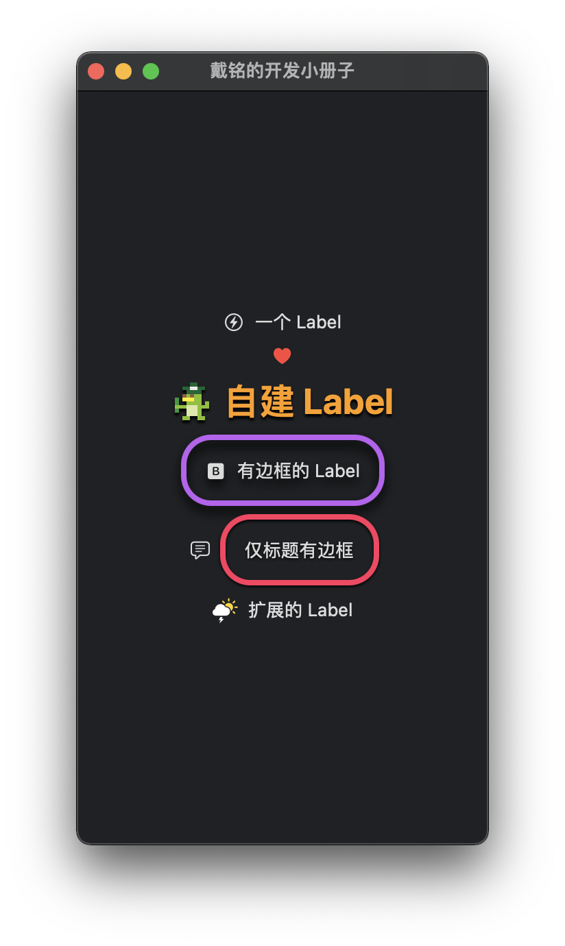
struct PlayLabelView: View {
    var body: some View {
        VStack(spacing: 10) {
            Label("一个 Label", systemImage: "bolt.circle")

            Label("只显示 icon", systemImage: "heart.fill")
                .labelStyle(.iconOnly)
                .foregroundColor(.red)

            // 自建 Label
            Label {
                Text("自建 Label")
                    .foregroundColor(.orange)
                    .bold()
                    .font(.largeTitle)
                    .shadow(color: .black, radius: 1, x: 0, y: 2)
            } icon: {
                Image("p3")
                    .resizable()
                    .aspectRatio(contentMode: .fit)
                    .frame(width: 30)
                    .shadow(color: .black, radius: 1, x: 0, y: 2)
            }


            // 自定义 LabelStyle
            Label("有边框的 Label", systemImage: "b.square.fill")
                .labelStyle(.border)

            Label("仅标题有边框", systemImage: "text.bubble")
                .labelStyle(.borderOnlyTitle)

            // 扩展的 Label
            Label("扩展的 Label", originalSystemImage: "cloud.sun.bolt.fill")

        } // end VStack
    } // end body
}

// 对 Label 做扩展
extension Label where Title == Text, Icon == Image {
    init(_ title: LocalizedStringKey, originalSystemImage systemImageString: String) {
        self.init {
            Text(title)
        } icon: {
            Image(systemName: systemImageString)
                .renderingMode(.original) // 让 SFSymbol 显示本身的颜色
        }

    }
}

// 添加自定义 LabelStyle,用来加上边框
struct BorderLabelStyle: LabelStyle {
    func makeBody(configuration: Configuration) -> some View {
        Label(configuration)
            .padding()
            .overlay(RoundedRectangle(cornerRadius: 20)
                        .stroke(.purple, lineWidth: 4))
            .shadow(color: .black, radius: 4, x: 0, y: 5)
            .labelStyle(.automatic) // 样式擦除器,防止样式被 .iconOnly、.titleOnly 这样的 LabelStyle 擦除了样式。

    }
}
extension LabelStyle where Self == BorderLabelStyle {
    internal static var border: BorderLabelStyle {
        BorderLabelStyle()
    }
}

// 只给标题加边框
struct BorderOnlyTitleLabelStyle: LabelStyle {
    func makeBody(configuration: Configuration) -> some View {
        HStack {
            configuration.icon
            configuration.title
                .padding()
                .overlay(RoundedRectangle(cornerRadius: 20)
                            .stroke(.pink, lineWidth: 4))
                .shadow(color: .black, radius: 1, x: 0, y: 1)
                .labelStyle(.automatic)
        }
    }
}
extension LabelStyle where Self == BorderOnlyTitleLabelStyle {
    internal static var borderOnlyTitle: BorderOnlyTitleLabelStyle {
        BorderOnlyTitleLabelStyle()
    }
}
TextEditor

对应的代码如下:
import SwiftUI
import CodeEditorView

struct PlayTextEditorView: View {
    // for TextEditor
    @State private var txt: String = "一段可编辑文字...\n"
    @State private var count: Int = 0

    // for CodeEditorView
    @Environment(\.colorScheme) private var colorScheme: ColorScheme
    @State private var codeMessages: Set<Located<Message>> = Set ()
    @SceneStorage("editLocation") private var editLocation: CodeEditor.Location = CodeEditor.Location()
    var body: some View {

        // 使用 SwiftUI 自带 TextEditor
        TextEditor(text: $txt)
            .font(.title)
            .lineSpacing(10)
            .disableAutocorrection(true)
            .padding()
            .onChange(of: txt) { newValue in
                count = txt.count
            }
        Text("字数:\(count)")
            .foregroundColor(.secondary)
            .font(.footnote)

        // 使用的 CodeEditorView 显示和编辑代码高亮的代码,还有 minimap
        CodeEditor(text: .constant("""
static func number() {
    // Int
    let i1 = 100
    let i2 = 22
    print(i1 / i2) // 向下取整得 4

    // Float
    let f1: Float = 100.0
    let f2: Float = 22.0
    print(f1 / f2) // 4.5454545

    let f4: Float32 = 5.0
    let f5: Float64 = 5.0
    print(f4, f5) // 5.0 5.0 5.0

    // Double
    let d1: Double = 100.0
    let d2: Double = 22.0
    print(d1 / d2) // 4.545454545454546

    // 字面量
    print(Int(0b10101)) // 0b 开头是二进制
    print(Int(0x00afff)) // 0x 开头是十六进制
    print(2.5e4) // 2.5x10^4 十进制用 e
    print(0xAp2) // 10*2^2  十六进制用 p
    print(2_000_000) // 2000000

    // isMultiple(of:) 方法检查一个数字是否是另一个数字的倍数
    let i3 = 36
    print(i3.isMultiple(of: 9)) // true
}
"""),
                   messages: $codeMessages,
                   language: .swift,
                   layout: CodeEditor.LayoutConfiguration(showMinimap: true)
        )
            .environment(\.codeEditorTheme, colorScheme == .dark ? Theme.defaultDark : Theme.defaultLight)

        // 包装的 NSTextView
        HSplitView {
            PNSTextView(text: .constant("左边写...\n"), onDidChange: { (s, i) in
                print("Typing \(i) times.")
            })
                .padding()
            PNSTextView(text: .constant("右边写...\n"))
                .padding()
        } // end HSplitView
    } // end body
}

// MARK: - 自己包装 NSTextView
struct PNSTextView: NSViewRepresentable {
    @Binding var text: String
    var onBeginEditing: () -> Void = {}
    var onCommit: () -> Void = {}
    var onDidChange: (String, Int) -> Void = { _,_  in }

    // 返回要包装的 NSView
    func makeNSView(context: Context) -> PNSTextConfiguredView {
        let t = PNSTextConfiguredView(text: text)
        t.delegate = context.coordinator
        return t
    }

    func updateNSView(_ view: PNSTextConfiguredView, context: Context) {
        view.text = text
        view.selectedRanges = context.coordinator.sRanges
    }

    // 回调
    func makeCoordinator() -> TextViewDelegate {
        TextViewDelegate(self)
    }
}

// 处理 delegate 回调
extension PNSTextView {
    class TextViewDelegate: NSObject, NSTextViewDelegate {
        var tView: PNSTextView
        var sRanges: [NSValue] = []
        var typeCount: Int = 0

        init(_ v: PNSTextView) {
            self.tView = v
        }
        // 开始编辑
        func textDidBeginEditing(_ notification: Notification) {
            guard let textView = notification.object as? NSTextView else {
                return
            }
            self.tView.text = textView.string
            self.tView.onBeginEditing()
        }
        // 每次敲字
        func textDidChange(_ notification: Notification) {
            guard let textView = notification.object as? NSTextView else {
                return
            }
            typeCount += 1
            self.tView.text = textView.string
            self.sRanges = textView.selectedRanges
            self.tView.onDidChange(textView.string, typeCount)
        }
        // 提交
        func textDidEndEditing(_ notification: Notification) {
            guard let textView = notification.object as? NSTextView else {
                return
            }
            self.tView.text = textView.string
            self.tView.onCommit()
        }
    }
}

// 配置 NSTextView
final class PNSTextConfiguredView: NSView {
    weak var delegate: NSTextViewDelegate?

    private lazy var tv: NSTextView = {
        let contentSize = sv.contentSize
        let textStorage = NSTextStorage()

        let layoutManager = NSLayoutManager()
        textStorage.addLayoutManager(layoutManager)

        let textContainer = NSTextContainer(containerSize: sv.frame.size)
        textContainer.widthTracksTextView = true
        textContainer.containerSize = NSSize(
            width: contentSize.width,
            height: CGFloat.greatestFiniteMagnitude
        )

        layoutManager.addTextContainer(textContainer)

        let t = NSTextView(frame: .zero, textContainer: textContainer)
        t.delegate = self.delegate
        t.isEditable = true
        t.allowsUndo = true

        t.font = .systemFont(ofSize: 24)
        t.textColor = NSColor.labelColor
        t.drawsBackground = true
        t.backgroundColor = NSColor.textBackgroundColor

        t.maxSize = NSSize(width: CGFloat.greatestFiniteMagnitude, height: CGFloat.greatestFiniteMagnitude)
        t.minSize = NSSize(width: 0, height: contentSize.height)
        t.autoresizingMask = .width

        t.isHorizontallyResizable = false
        t.isVerticallyResizable   = true

        return t
    }()

    private lazy var sv: NSScrollView = {
        let s = NSScrollView()
        s.drawsBackground = true
        s.borderType = .noBorder
        s.hasVerticalScroller = true
        s.hasHorizontalRuler = false
        s.translatesAutoresizingMaskIntoConstraints = false
        s.autoresizingMask = [.width, .height]
        return s
    }()

    var text: String {
        didSet {
            tv.string = text
        }
    }

    var selectedRanges: [NSValue] = [] {
        didSet {
            guard selectedRanges.count > 0 else {
                return
            }
            tv.selectedRanges = selectedRanges
        }
    }

    required init?(coder: NSCoder) {
        fatalError("Error coder")
    }

    init(text: String) {
        self.text = text
        super.init(frame: .zero)
    }

    override func viewWillDraw() {
        super.viewWillDraw()
        sv.translatesAutoresizingMaskIntoConstraints = false
        addSubview(sv)
        NSLayoutConstraint.activate([
            sv.topAnchor.constraint(equalTo: topAnchor),
            sv.trailingAnchor.constraint(equalTo: trailingAnchor),
            sv.bottomAnchor.constraint(equalTo: bottomAnchor),
            sv.leadingAnchor.constraint(equalTo: leadingAnchor)
        ])
        sv.documentView = tv
    } // end viewWillDraw

}
SwiftUI 中用 NSView,可以通过 NSViewRepresentable 来包装视图,这个协议主要是实现 makeNSView、updateNSView 和 makeCoordinator 三个方法。makeNSView 要求返回需要包装的 NSView。每当 SwiftUI 的状态变化时触发 updateNSView 方法的调用。为了实现 NSView 里的 delegate 和 SwiftUI 通信,就要用 makeCoordinator 返回一个用于处理 delegate 的实例。
TextField
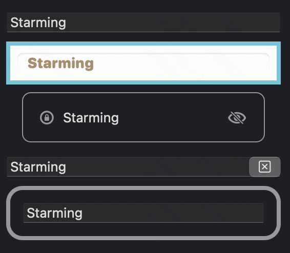
使用方法如下:
struct PlayTextFieldView: View {
    @State private var t = "Starming"
    @State private var showT = ""
    @State private var isEditing = false
    var placeholder = "输入些文字..."

    @FocusState private var isFocus: Bool

    var body: some View {
        VStack {
            TextField(placeholder, text: $t)

            // 样式设置
            TextField(placeholder, text: $t)
                .padding(10)
                .textFieldStyle(.roundedBorder) // textFieldStyle 有三个预置值 automatic、plain 和 roundedBorder。
                .multilineTextAlignment(.leading) // 对齐方式
                .font(.system(size: 14, weight: .heavy, design: .rounded))
                .border(.teal, width: 4)
                .background(.white)
                .foregroundColor(.brown)
                .textCase(.uppercase)

            // 多视图组合
            HStack {
                Image(systemName: "lock.circle")
                    .foregroundColor(.gray).font(.headline)
                TextField(placeholder, text: $t)
                    .textFieldStyle(.plain)
                    .submitLabel(.done)
                    .onSubmit {
                        showT = t
                        isFocus = true
                    }
                    .onChange(of: t) { newValue in
                        t = String(newValue.prefix(20)) // 限制字数
                    }
                Image(systemName: "eye.slash")
                    .foregroundColor(.gray)
                    .font(.headline)
            }
            .padding()
            .overlay(
                RoundedRectangle(cornerRadius: 8)
                    .stroke(.gray, lineWidth: 1)
            )
            .padding(.horizontal)

            Text(showT)


            // 自定义 textFieldStyle 样式
            TextField(placeholder, text: $t)
                .textFieldStyle(PClearTextStyle())
                .focused($isFocus)
        }
        .padding()
    } // end body
}

struct PClearTextStyle: TextFieldStyle {
    @ViewBuilder
    func _body(configuration: TextField<_Label>) -> some View {
        let mirror = Mirror(reflecting: configuration)
        let bindingText: Binding<String> = mirror.descendant("_text") as! Binding<String>
        configuration
            .overlay(alignment: .trailing) {
                Button(action: {
                    bindingText.wrappedValue = ""
                }, label: {
                    Image(systemName: "clear")
                })
            }

        let text: String = mirror.descendant("_text", "_value") as! String
        configuration
            .padding()
            .background(
                RoundedRectangle(cornerRadius: 16)
                    .strokeBorder(text.count > 10 ? .pink : .gray, lineWidth: 4)
            )
    } // end func
}
目前iOS 和 iPadOS上支持的键盘有:
- asciiCapable:能显示标准 ASCII 字符的键盘
- asciiCapableNumberPad:只输出 ASCII 数字的数字键盘
- numberPad:用于输入 PIN 码的数字键盘
- numbersAndPunctuation:数字和标点符号的键盘
- decimalPad:带有数字和小数点的键盘
- phonePad:电话中使用的键盘
- namePhonePad:用于输入人名或电话号码的小键盘
- URL:用于输入URL的键盘
- emailAddress:用于输入电子邮件地址的键盘
- twitter:用于Twitter文本输入的键盘,支持@和#字符简便输入
- webSearch:用于网络搜索词和URL输入的键盘
可以通过 keyboardType 修改器来指定。
支持多行,使用 Axis.vertical 以允许多行。TextField 超过行限制可以变成滚动视图。
今年 TextField 可以嵌到 .alert 里了。
Button

struct PlayButtonView: View {
    var asyncAction: () async -> Void = {
        do {
            try await Task.sleep(nanoseconds: 300_000_000)
        } catch {}
    }
    @State private var isFollowed: Bool = false
    var body: some View {
        VStack {
            // 常用方式
            Button {
                print("Clicked")
            } label: {
                Image(systemName: "ladybug.fill")
                Text("Report Bug")
            }

            // 图标
            Button(systemIconName: "ladybug.fill") {
                print("bug")
            }
            .buttonStyle(.plain) // 无背景
            .simultaneousGesture(LongPressGesture().onEnded({ _ in
                print("长按") // macOS 暂不支持
            }))
            .simultaneousGesture(TapGesture().onEnded({ _ in
                print("短按") // macOS 暂不支持
            }))


            // iOS 15 修改器的使用。role 在 macOS 上暂不支持
            Button("要删除了", role: .destructive) {
                print("删除")
            }
            .tint(.purple)
            .controlSize(.large) // .regular 是默认大小
            .buttonStyle(.borderedProminent) // borderedProminent 可显示 tint 的设置。还有 bordered、plain 和 borderless 可选。
            .clipShape(RoundedRectangle(cornerRadius: 5))
            .accentColor(.pink)
            .buttonBorderShape(.automatic) // 会依据 controlSize 调整边框样式
            .background(.ultraThinMaterial, in: Capsule()) // 添加材质就像在视图和背景间加了个透明层达到模糊的效果。效果由高到底分别是.ultraThinMaterial、.thinMaterial、.regularMaterial、.thickMaterial、.ultraThickMaterial。

            // 风格化
            Button(action: {
                //
            }, label: {
                Text("风格化").font(.largeTitle)
            })
            .buttonStyle(PStarmingButtonStyle())


            // 自定义 Button
            PCustomButton("点一下触发") {
                print("Clicked!")
            }

            // 自定义 ButtonStyle
            Button {
                print("Double Clicked!")
            } label: {
                Text("点两下触发")
            }
            .buttonStyle(PCustomPrimitiveButtonStyle())

            // 将 Text 视图加上另一个 Text 视图中,类型仍还是 Text。
            PCustomButton(Text("点我 ").underline() + Text("别犹豫").font(.title) + Text("🤫悄悄说声,有惊喜").font(.footnote).foregroundColor(.secondary)) {
                print("多 Text 组合标题按钮点击!")
            }

            // 异步按钮
            ButtonAsync {
                await asyncAction()
                isFollowed = true
            } label: {
                if isFollowed == true {
                    Text("已关注")
                } else {
                    Text("关注")
                }
            }
            .font(.largeTitle)
            .disabled(isFollowed)
            .buttonStyle(PCustomButtonStyle(backgroundColor: isFollowed == true ? .gray : .pink))
        }
        .padding()
        .background(Color.skeumorphismBG)

    }
}

// MARK: - 异步操作的按钮
struct ButtonAsync<Label: View>: View {
    var doAsync: () async -> Void
    @ViewBuilder var label: () -> Label
    @State private var isRunning = false // 避免连续点击造成重复执行事件

    var body: some View {
        Button {
            isRunning = true
            Task {
                await doAsync()
                isRunning = false
            }
        } label: {
            label().opacity(isRunning == true ? 0 : 1)
            if isRunning == true {
                ProgressView()
            }
        }
        .disabled(isRunning)

    }
}

// MARK: - 扩展 Button
// 使用 SFSymbol 做图标
extension Button where Label == Image {
    init(systemIconName: String, done: @escaping () -> Void) {
        self.init(action: done) {
            Image(systemName: systemIconName)
                .renderingMode(.original)
        }
    }
}

// MARK: - 自定义 Button
struct PCustomButton: View {
    let desTextView: Text
    let act: () -> Void

    init(_ des: LocalizedStringKey, act: @escaping () -> Void) {
        self.desTextView = Text(des)
        self.act = act
    }

    var body: some View {
        Button {
            act()
        } label: {
            desTextView.bold()
        }
        .buttonStyle(.starming)
    }
}

extension PCustomButton {
    init(_ desTextView: Text, act: @escaping () -> Void) {
        self.desTextView = desTextView
        self.act = act
    }
}

// 点语法使用自定义样式
extension ButtonStyle where Self == PCustomButtonStyle {
    static var starming: PCustomButtonStyle {
        PCustomButtonStyle(cornerRadius: 15)
    }
}


// MARK: - ButtonStyle
struct PCustomButtonStyle: ButtonStyle {
    var cornerRadius:Double = 10
    var backgroundColor: Color = .pink
    func makeBody(configuration: Configuration) -> some View {
        HStack {
            Spacer()
            configuration.label
            Spacer()
        }
        .padding()
        .background(
            RoundedRectangle(cornerRadius: cornerRadius, style: .continuous)
                .fill(backgroundColor)
                .shadow(color: configuration.isPressed ? .white : .black, radius: 1, x: 0, y: 1)
        )
        .opacity(configuration.isPressed ? 0.5 : 1)
        .scaleEffect(configuration.isPressed ? 0.99 : 1)

    }
}

// MARK: - PrimitiveButtonStyle
struct PCustomPrimitiveButtonStyle: PrimitiveButtonStyle {
    func makeBody(configuration: Configuration) -> some View {
        // 双击触发
        configuration.label
            .onTapGesture(count: 2) {
                configuration.trigger()
            }
        // 手势识别
        Button(configuration)
            .gesture(
                LongPressGesture()
                    .onEnded({ _ in
                        configuration.trigger()
                    })
            )
    }
}

// MARK: - 风格化
struct PStarmingButtonStyle: ButtonStyle {
    var backgroundColor = Color.skeumorphismBG
    func makeBody(configuration: Configuration) -> some View {
        HStack {
            Spacer()
            configuration.label
            Spacer()
        }
        .padding(20)
        .background(
            ZStack {
                RoundedRectangle(cornerRadius: 10, style: .continuous)
                    .shadow(color: .white, radius: configuration.isPressed ? 7 : 10, x: configuration.isPressed ? -5 : -10, y: configuration.isPressed ? -5 : -10)
                    .shadow(color: .black, radius: configuration.isPressed ? 7 : 10, x: configuration.isPressed ? 5 : 10, y: configuration.isPressed ? 5 : 10)
                    .blendMode(.overlay)
                RoundedRectangle(cornerRadius: 10, style: .continuous)
                    .fill(backgroundColor)
            }
        )
        .scaleEffect(configuration.isPressed ? 0.98 : 1)
    }
}

extension Color {
    static let skeumorphismBG = Color(hex: "f0f0f3")
}

extension Color {
    init(hex: String) {
        var rgbValue: UInt64 = 0
        Scanner(string: hex).scanHexInt64(&rgbValue)

        let r = (rgbValue & 0xff0000) >> 16
        let g = (rgbValue & 0xff00) >> 8
        let b = rgbValue & 0xff

        self.init(red: Double(r) / 0xff, green: Double(g) / 0xff, blue: Double(b) / 0xff)
    }
}
.buttonStyle 可组合,示例如下:
struct PButtonStyleComposition: View {
    @State private var isT = false
    var body: some View {
        Section("标签") {
            VStack(alignment: .leading) {
                HStack {
                    Toggle("Swift", isOn: $isT)
                    Toggle("SwiftUI", isOn: $isT)
                }
                HStack {
                    Toggle("Swift Chart", isOn: $isT)
                    Toggle("Navigation API", isOn: $isT)
                }
            }
            .toggleStyle(.button)
            .buttonStyle(.bordered)
        }
    }
}
Tap Location 可以获取点击的位置,示例代码如下:
Rectangle()
    .fill(.green)
    .frame(width: 50, height: 50)
    .onTapGesture(coordinateSpace: .global) { location in
        print("Tap in \(location)")
    }
其中 coordinateSpace 指定为 .global 表示位置是相对屏幕左上角,默认是相对当前视图的左上角的位置。
进度
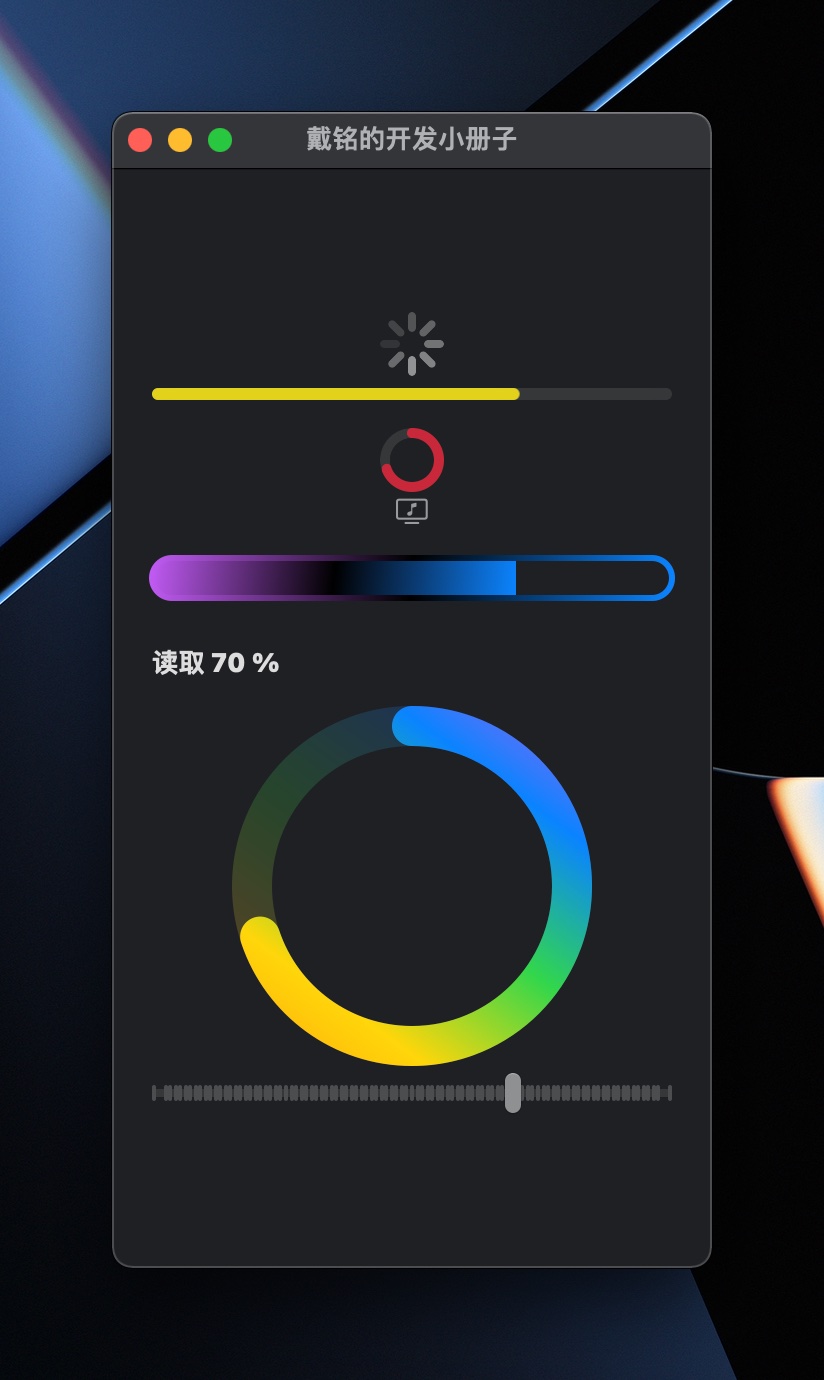
用 ProgressViewStyle 协议,可以创建自定义的进度条视图。在 WatchOS 上会多一个 Guage 视图。
struct PlayProgressView: View {
    @State private var v: CGFloat = 0.0
    var body: some View {
        VStack {
            // 默认旋转
            ProgressView()

            // 有进度条
            ProgressView(value: v / 100)
                .tint(.yellow)

            ProgressView(value: v / 100) {
                Image(systemName: "music.note.tv")
            }
            .progressViewStyle(CircularProgressViewStyle(tint: .pink))

            // 自定义样式
            ProgressView(value: v / 100)
                .padding(.vertical)
                .progressViewStyle(PCProgressStyle1(borderWidth: 3))

            ProgressView(value: v / 100)
                .progressViewStyle(PCProgressStyle2())
                .frame(height:200)

            Slider(value: $v, in: 0...100, step: 1)
        }
        .padding(20)
    }
}

// 自定义 Progress 样式
struct PCProgressStyle1: ProgressViewStyle {
    var lg = LinearGradient(colors: [.purple, .black, .blue], startPoint: .topLeading, endPoint: .bottomTrailing)
    var borderWidth: Double = 2

    func makeBody(configuration: Configuration) -> some View {
        let fc = configuration.fractionCompleted ?? 0

        return VStack {
            ZStack(alignment: .topLeading) {
                GeometryReader { g in
                    Rectangle()
                        .fill(lg)
                        .frame(maxWidth: g.size.width * CGFloat(fc))
                }
            }
            .frame(height: 20)
            .cornerRadius(10)
            .overlay(
                RoundedRectangle(cornerRadius: 10)
                    .stroke(lg, lineWidth: borderWidth)
            )
            // end ZStack
        } // end VStack
    }
}

struct PCProgressStyle2: ProgressViewStyle {
    var lg = LinearGradient(colors: [.orange, .yellow, .green, .blue, .purple], startPoint: .topLeading, endPoint: .bottomTrailing)

    var borderWidth: Double = 20

    func makeBody(configuration: Configuration) -> some View {
        let fc = configuration.fractionCompleted ?? 0

        func strokeStyle(_ g: GeometryProxy) -> StrokeStyle {
            StrokeStyle(lineWidth: 0.1 * min(g.size.width, g.size.height), lineCap: .round)
        }

        return VStack {
            GeometryReader { g in
                ZStack {
                    Group {
                        Circle()
                            .trim(from: 0, to: 1)
                            .stroke(lg, style: strokeStyle(g))
                            .padding(borderWidth)
                            .opacity(0.2)
                        Circle()
                            .trim(from: 0, to: fc)
                            .stroke(lg, style: strokeStyle(g))
                            .padding(borderWidth)
                    }
                    .rotationEffect(.degrees(90 + 360 * 0.5), anchor: .center)
                    .offset(x: 0, y: 0.1 * min(g.size.width, g.size.height))
                }

                Text("读取 \(Int(fc * 100)) %")
                    .bold()
                    .font(.headline)
            }
            // end ZStack
        } // end VStack
    }
}
SwiftUI 引入一个新显示进度的视图 Gauge。
简单示例如下:
struct PGauge: View {
    @State private var progress = 0.45
    var body: some View {
        Gauge(value: progress) {
            Text("进度")
        } currentValueLabel: {
            Text(progress.formatted(.percent))
        } minimumValueLabel: {
            Text(0.formatted(.percent))
        } maximumValueLabel: {
            Text(100.formatted(.percent))
        }

        Gauge(value: progress) {

        } currentValueLabel: {
            Text(progress.formatted(.percent))
                .font(.footnote)
        }
        .gaugeStyle(.accessoryCircularCapacity)
        .tint(.cyan)
    }
}
Image
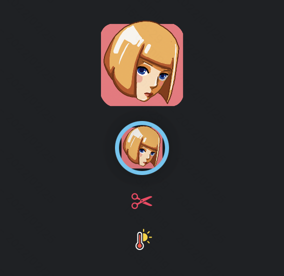
struct PlayImageView: View {
    var body: some View {
        Image("logo")
            .resizable()
            .frame(width: 100, height: 100)

        Image("logo")
            .resizable()
            .aspectRatio(contentMode: .fit)
            .frame(width: 50, height: 50)
            .clipShape(Circle())
            .overlay(
                Circle().stroke(.cyan, lineWidth: 4)
            )
            .shadow(radius: 10)

        // SF Symbols
        Image(systemName: "scissors")
            .imageScale(.large)
            .foregroundColor(.pink)
            .frame(width: 40, height: 40)

        // SF Symbols 多色时使用原色
        Image(systemName: "thermometer.sun.fill")
            .renderingMode(.original)
            .imageScale(.large)
    }
}
ControlGroup
struct PlayControlGroupView: View {
    var body: some View {
        ControlGroup {
            Button {
                print("plus")
            } label: {
                Image(systemName: "plus")
            }

            Button {
                print("minus")
            } label: {
                Image(systemName: "minus")
            }
        }
        .padding()
        .controlGroupStyle(.automatic) // .automatic 是默认样式,还有 .navigation
    }
}
GroupBox

struct PlayGroupBoxView: View {
    var body: some View {
        GroupBox {
            Text("这是 GroupBox 的内容")
        } label: {
            Label("标题一", systemImage: "t.square.fill")
        }
        .padding()

        GroupBox {
            Text("还是 GroupBox 的内容")
        } label: {
            Label("标题二", systemImage: "t.square.fill")
        }
        .padding()
        .groupBoxStyle(PCGroupBoxStyle())

    }
}

struct PCGroupBoxStyle: GroupBoxStyle {
    func makeBody(configuration: Configuration) -> some View {
        VStack(alignment: .leading) {
            configuration.label
                .font(.title)
            configuration.content
        }
        .padding()
        .background(.pink)
        .clipShape(RoundedRectangle(cornerRadius: 8, style: .continuous))
    }
}
Stack
Stack View 有 VStack、HStack 和 ZStack

struct PlayStackView: View {
    var body: some View {
        // 默认是 VStack 竖排

        // 横排
        HStack {
            Text("左")
            Spacer()
            Text("右")
        }
        .padding()

        // Z 轴排
        ZStack(alignment: .top) {
            Image("logo")
            Text("戴铭的开发小册子")
                .font(.title)
                .bold()
                .foregroundColor(.white)
                .shadow(color: .black, radius: 1, x: 0, y: 2)
                .padding()
        }

        Color.cyan
            .cornerRadius(10)
            .frame(width: 100, height: 100)
            .overlay(
                Text("一段文字")
            )
    }
}
Advanced layout control
session Compose custom layouts with SwiftUI
提供了新的 Grid 视图来同时满足 VStack 和 HStack。还有一个更低级别 Layout 接口,可以完全控制构建应用所需的布局。另外还有 ViewThatFits 可以自动选择填充可用空间的方式。
Grid 示例代码如下:
Grid {
    GridRow {
        Text("One")
        Text("One")
        Text("One")
    }
    GridRow {
        Text("Two")
        Text("Two")
    }
    Divider()
    GridRow {
        Text("Three")
        Text("Three")
            .gridCellColumns(2)
    }
}
gridCellColumns() modifier 可以让一个单元格跨多列。
ViewThatFits 的新视图,允许根据适合的大小放视图。ViewThatFits 会自动选择对于当前屏幕大小合适的子视图进行显示。Ryan Lintott 的示例效果 ,对应示例代码 LayoutThatFits.swift 。
新的 Layout 协议可以观看 Swift Talk 第 308 期 The Layout Protocol 。
通过符合 Layout 协议,我们可以自定义一个自定义的布局容器,直接参与 SwiftUI 的布局过程。新的 ProposedViewSize 结构,它是容器视图提供的大小。 Layout.Subviews 是布局视图的子视图代理集合,我们可以在其中为每个子视图请求各种布局属性。
public protocol Layout: Animatable {
  static var layoutProperties: LayoutProperties { get }
  associatedtype Cache = Void
  typealias Subviews = LayoutSubviews

  func updateCache(_ cache: inout Self.Cache, subviews: Self.Subviews)

  func spacing(subviews: Self.Subviews, cache: inout Self.Cache) -> ViewSpacing

  /// We return our view size here, use the passed parameters for computing the
  /// layout.
  func sizeThatFits(
    proposal: ProposedViewSize,
    subviews: Self.Subviews,
    cache: inout Self.Cache // 👈🏻 use this for calculated data shared among Layout methods
  ) -> CGSize

  /// Use this to tell your subviews where to appear.
  func placeSubviews(
    in bounds: CGRect, // 👈🏻 region where we need to place our subviews into, origin might not be .zero
    proposal: ProposedViewSize,
    subviews: Self.Subviews,
    cache: inout Self.Cache
  )

  // ... there are more a couple more optional methods
}
下面例子是一个自定义的水平 stack 视图,为其所有子视图提供其最大子视图的宽度:
struct MyEqualWidthHStack: Layout {
  /// Returns a size that the layout container needs to arrange its subviews.
  /// - Tag: sizeThatFitsHorizontal
  func sizeThatFits(
    proposal: ProposedViewSize,
    subviews: Subviews,
    cache: inout Void
  ) -> CGSize {
    guard !subviews.isEmpty else { return .zero }

    let maxSize = maxSize(subviews: subviews)
    let spacing = spacing(subviews: subviews)
    let totalSpacing = spacing.reduce(0) { $0 + $1 }

    return CGSize(
      width: maxSize.width * CGFloat(subviews.count) + totalSpacing,
      height: maxSize.height)
  }

  /// Places the stack's subviews.
  /// - Tag: placeSubviewsHorizontal
  func placeSubviews(
    in bounds: CGRect,
    proposal: ProposedViewSize,
    subviews: Subviews,
    cache: inout Void
  ) {
    guard !subviews.isEmpty else { return }

    let maxSize = maxSize(subviews: subviews)
    let spacing = spacing(subviews: subviews)

    let placementProposal = ProposedViewSize(width: maxSize.width, height: maxSize.height)
    var nextX = bounds.minX + maxSize.width / 2

    for index in subviews.indices {
      subviews[index].place(
        at: CGPoint(x: nextX, y: bounds.midY),
        anchor: .center,
        proposal: placementProposal)
      nextX += maxSize.width + spacing[index]
    }
  }

  /// Finds the largest ideal size of the subviews.
  private func maxSize(subviews: Subviews) -> CGSize {
    let subviewSizes = subviews.map { $0.sizeThatFits(.unspecified) }
    let maxSize: CGSize = subviewSizes.reduce(.zero) { currentMax, subviewSize in
      CGSize(
        width: max(currentMax.width, subviewSize.width),
        height: max(currentMax.height, subviewSize.height))
    }

    return maxSize
  }

  /// Gets an array of preferred spacing sizes between subviews in the
  /// horizontal dimension.
  private func spacing(subviews: Subviews) -> [CGFloat] {
    subviews.indices.map { index in
      guard index < subviews.count - 1 else { return 0 }
      return subviews[index].spacing.distance(
        to: subviews[index + 1].spacing,
        along: .horizontal)
    }
  }
}
自定义 layout 只能访问子视图代理 Layout.Subviews ,而不是视图或数据模型。我们可以通过 LayoutValueKey 在每个子视图上存储自定义值,通过 layoutValue(key:value:) modifier 设置。
private struct Rank: LayoutValueKey {
  static let defaultValue: Int = 1
}

extension View {
  func rank(_ value: Int) -> some View { // 👈🏻 convenience method
    layoutValue(key: Rank.self, value: value) // 👈🏻 the new modifier
  }
}
然后,我们就可以通过 Layout 方法中的 Layout.Subviews 代理读取自定义 LayoutValueKey 值:
func placeSubviews(
  in bounds: CGRect,
  proposal: ProposedViewSize,
  subviews: Subviews,
  cache: inout Void
) {
  let ranks = subviews.map { subview in
    subview[Rank.self] // 👈🏻
  }

  // ...
}
要在布局之间变化使用动画,需要用 AnyLayout,代码示例如下:
struct PAnyLayout: View {
    @State private var isVertical = false
    var body: some View {
        let layout = isVertical ? AnyLayout(VStack()) : AnyLayout(HStack())
        layout {
            Image(systemName: "star").foregroundColor(.yellow)
            Text("Starming.com")
            Text("戴铭")
        }
        Button("Click") {
            withAnimation {
                isVertical.toggle()
            }
        } // end button
    } // end body
}
同时 Text 和图片也支持了样式布局变化,代码示例如下:
struct PTextTransitionsView: View {
    @State private var expandMessage = true
    private let mintWithShadow: AnyShapeStyle = AnyShapeStyle(Color.mint.shadow(.drop(radius: 2)))
    private let primaryWithoutShadow: AnyShapeStyle = AnyShapeStyle(Color.primary.shadow(.drop(radius: 0)))

    var body: some View {
        Text("Dai Ming Swift Pamphlet")
            .font(expandMessage ? .largeTitle.weight(.heavy) : .body)
            .foregroundStyle(expandMessage ? mintWithShadow : primaryWithoutShadow)
            .onTapGesture { withAnimation { expandMessage.toggle() }}
            .frame(maxWidth: expandMessage ? 150 : 250)
            .drawingGroup()
            .padding(20)
            .background(.cyan.opacity(0.3), in: RoundedRectangle(cornerRadius: 6))
    }
}
Navigation
控制导航启动状态、管理 size class 之间的 transition 和响应 deep link。
Navigation bar 有新的默认行为,如果没有提供标题,导航栏默认为 inline title 显示模式。使用 navigationBarTitleDisplayMode(_:) 改变显示模式。如果 navigation bar 没有标题、工具栏项或搜索内容,它就会自动隐藏。使用 .toolbar(.visible) modifier 显示一个空 navigation bar。
参考:
- Migrating to New Navigation Types 官方迁移指南
- NavigationStack
- NavigationSplitView
- The SwiftUI cookbook for navigation
NavigationStack 的示例:
struct PNavigationStack: View {
    @State private var a = [1, 3, 9] // 深层链接
    var body: some View {
        NavigationStack(path: $a) {
            List(1..<10) { i in
                NavigationLink(value: i) {
                    Label("第 \(i) 行", systemImage: "\(i).circle")
                }
            }
            .navigationDestination(for: Int.self) { i in
                Text("第 \(i) 行内容")
            }
            .navigationTitle("NavigationStack Demo")
        }
    }
}
这里的 path 设置了 stack 的深度路径。
NavigationSplitView 两栏的例子:
struct PNavigationSplitViewTwoColumn: View {
    @State private var a = ["one", "two", "three"]
    @State private var choice: String?

    var body: some View {
        NavigationSplitView {
            List(a, id: \.self, selection: $choice, rowContent: Text.init)
        } detail: {
            Text(choice ?? "选一个")
        }
    }
}
NavigationSplitView 三栏的例子:
struct PNavigationSplitViewThreeColumn: View {
    struct Group: Identifiable, Hashable {
        let id = UUID()
        var title: String
        var subs: [String]
    }

    @State private var gps = [
        Group(title: "One", subs: ["o1", "o2", "o3"]),
        Group(title: "Two", subs: ["t1", "t2", "t3"])
    ]

    @State private var choiceGroup: Group?
    @State private var choiceSub: String?

    @State private var cv = NavigationSplitViewVisibility.automatic

    var body: some View {
        NavigationSplitView(columnVisibility: $cv) {
            List(gps, selection: $choiceGroup) { g in
                Text(g.title).tag(g)
            }
            .navigationSplitViewColumnWidth(250)
        } content: {
            List(choiceGroup?.subs ?? [], id: \.self, selection: $choiceSub) { s in
                Text(s)
            }
        } detail: {
            Text(choiceSub ?? "选一个")
            Button("点击") {
                cv = .all
            }
        }
        .navigationSplitViewStyle(.prominentDetail)
    }
}
navigationSplitViewColumnWidth() 是用来自定义宽的,navigationSplitViewStyle 设置为 .prominentDetail 是让 detail 的视图尽量保持其大小。
SwiftUI 新加了个功能可以配置是否隐藏 Tabbar,这样在从主页进入下一级时就可以选择不显示底部标签栏了,示例代码如下:
ContentView().toolbar(.hidden, in: .tabBar)相比较以前 NavigationView 增强的是 destination 可以根据值的不同类型展示不同的目的页面,示例代码如下:
struct PNavigationStackDestination: View {
    var body: some View {
        NavigationStack {
            List {
                NavigationLink(value: "字符串") {
                    Text("字符串")
                }
                NavigationLink(value: Color.red) {
                    Text("红色")
                }
            }
            .navigationTitle("不同类型 Destination")
            .navigationDestination(for: Color.self) { c in
                c.clipShape(Circle())
            }
            .navigationDestination(for: String.self) { s in
                Text("\(s) 的 detail")
            }
        }
    }
}
对 toolbar 的自定义,示例如下:
.toolbar(id: "toolbar") {
    ToolbarItem(id: "new", placement: .secondaryAction) {
        Button(action: {}) {
            Label("New Invitation", systemImage: "envelope")
        }
    }
}
.toolbarRole(.editor)
以下是废弃的 NavigationView 的用法。

对应代码如下:
struct PlayNavigationView: View {
    let lData = 1...10
    var body: some View {
        NavigationView {
            ZStack {
                LinearGradient(colors: [.pink, .orange], startPoint: .topLeading, endPoint: .bottomTrailing)
                    .ignoresSafeArea()

                List(lData, id: \.self) { i in
                    NavigationLink {
                        PNavDetailView(contentStr: "\(i)")
                    } label: {
                        Text("\(i)")
                    }
                }
            }

            ZStack {
                LinearGradient(colors: [.mint, .yellow], startPoint: .topLeading, endPoint: .bottomTrailing)
                    .ignoresSafeArea()

                VStack {
                    Text("一个 NavigationView 的示例")
                        .bold()
                        .font(.largeTitle)
                        .shadow(color: .white, radius: 9, x: 0, y: 0)
                        .scaleEffect(2)
                }
            }
            .safeAreaInset(edge: .bottom) {
                HStack {
                    Button("bottom1") {}
                    .font(.headline)
                    Button("bottom2") {}
                    Button("bottom3") {}
                    Spacer()
                }
                .padding(5)
                .background(LinearGradient(colors: [.purple, .blue], startPoint: .topLeading, endPoint: .bottomTrailing))
            }
        }
        .foregroundColor(.white)
        .navigationTitle("数字列表")
        .toolbar {
            // placement 共有 keyboard、destructiveAction、cancellationAction、confirmationAction、status、primaryAction、navigation、principal、automatic 这些
            ToolbarItem(placement: .primaryAction) {
                Button("primaryAction") {}
                .background(.ultraThinMaterial)
                .font(.headline)
            }
            // 通过 ToolbarItemGroup 可以简化相同位置 ToolbarItem 的编写。
            ToolbarItemGroup(placement: .navigation) {
                Button("返回") {}
                Button("前进") {}
            }
            PCToolbar(doDestruct: {
                print("删除了")
            }, doCancel: {
                print("取消了")
            }, doConfirm: {
                print("确认了")
            })
            ToolbarItem(placement: .status) {
                Button("status") {}
            }
            ToolbarItem(placement: .principal) {
                Button("principal") {

                }
            }
            ToolbarItem(placement: .keyboard) {
                Button("Touch Bar Button") {}
            }
        } // end toolbar
    }
}

// MARK: - NavigationView 的目的页面
struct PNavDetailView: View {
    @Environment(\.presentationMode) var pMode: Binding<PresentationMode>
    var contentStr: String
    var body: some View {
        ZStack {
            LinearGradient(colors: [.purple, .blue], startPoint: .topLeading, endPoint: .bottomTrailing)
                .ignoresSafeArea()
            VStack {
                Text(contentStr)
                Button("返回") {
                    pMode.wrappedValue.dismiss()
                }
            }
        } // end ZStack
    } // end body
}

// MARK: - 自定义 toolbar
// 通过 ToolbarContent 创建可重复使用的 toolbar 组
struct PCToolbar: ToolbarContent {
    let doDestruct: () -> Void
    let doCancel: () -> Void
    let doConfirm: () -> Void

    var body: some ToolbarContent {
        ToolbarItem(placement: .destructiveAction) {
            Button("删除", action: doDestruct)
        }
        ToolbarItem(placement: .cancellationAction) {
            Button("取消", action: doCancel)
        }
        ToolbarItem(placement: .confirmationAction) {
            Button("确定", action: doConfirm)
        }
    }
}
toolbar 的位置设置可选项如下:
- primaryAction:放置到最主要位置,macOS 就是放在 toolbar 的最左边
- automatic:根据平台不同放到默认位置
- confirmationAction:一些确定的动作
- cancellationAction:取消动作
- destructiveAction:删除的动作
- status:状态变化,比如检查更新等动作
- navigation:导航动作,比如浏览器的前进后退
- principal:突出的位置,iOS 和 macOS 会出现在中间的位置
- keyboard:macOS 会出现在 Touch Bar 里。iOS 会出现在弹出的虚拟键盘上。
List

List 除了能够展示数据外,还有下拉刷新、过滤搜索和侧滑 Swipe 动作提供更多 Cell 操作的能力。
通过 List 的可选子项参数提供数据模型的关键路径来制定子项路劲,还可以实现大纲视图,使用 DisclosureGroup 和 OutlineGroup 可以进一步定制大纲视图。
下面是 List 使用,包括了 DisclosureGroup 和 OutlineGroup 的演示代码:
struct PlayListView: View {
    @StateObject var l: PLVM = PLVM()
    @State private var s: String = ""

    var outlineModel = [
        POutlineModel(title: "文件夹一", iconName: "folder.fill", children: [
            POutlineModel(title: "个人", iconName: "person.crop.circle.fill"),
            POutlineModel(title: "群组", iconName: "person.2.circle.fill"),
            POutlineModel(title: "加好友", iconName: "person.badge.plus")
        ]),
        POutlineModel(title: "文件夹二", iconName: "folder.fill", children: [
            POutlineModel(title: "晴天", iconName: "sun.max.fill"),
            POutlineModel(title: "夜间", iconName: "moon.fill"),
            POutlineModel(title: "雨天", iconName: "cloud.rain.fill", children: [
                POutlineModel(title: "雷加雨", iconName: "cloud.bolt.rain.fill"),
                POutlineModel(title: "太阳雨", iconName: "cloud.sun.rain.fill")
            ])
        ]),
        POutlineModel(title: "文件夹三", iconName: "folder.fill", children: [
            POutlineModel(title: "电话", iconName: "phone"),
            POutlineModel(title: "拍照", iconName: "camera.circle.fill"),
            POutlineModel(title: "提醒", iconName: "bell")
        ])
    ]

    var body: some View {
        HStack {
            // List 通过$语法可以将集合的元素转换成可绑定的值
            List {
                ForEach($l.ls) { $d in
                    PRowView(s: d.s, i: d.i)
                        .listRowInsets(EdgeInsets(top: 5, leading: 15, bottom: 5, trailing: 15))
                        .listRowBackground(Color.black.opacity(0.2))
                }
            }
            .refreshable {
                // 下拉刷新
            }
            .searchable(text: $s) // 搜索
            .onChange(of: s) { newValue in
                print("搜索关键字:\(s)")
            }

            Divider()

            // 自定义 List
            VStack {
                PCustomListView($l.ls) { $d in
                    PRowView(s: d.s, i: d.i)
                }
                // 添加数据
                Button {
                    l.ls.append(PLModel(s: "More", i: 0))
                } label: {
                    Text("添加")
                }
            }
            .padding()

            Divider()

            // 使用大纲
            List(outlineModel, children: \.children) { i in
                Label(i.title, systemImage: i.iconName)
            }

            Divider()

            // 自定义大纲视图
            VStack {
                Text("可点击标题展开")
                    .font(.headline)
                PCOutlineListView(d: outlineModel, c: \.children) { i in
                    Label(i.title, systemImage: i.iconName)
                }
            }
            .padding()

            Divider()

            // 使用 OutlineGroup 实现大纲视图
            VStack {
                Text("OutlineGroup 实现大纲")

                OutlineGroup(outlineModel, children: \.children) { i in
                    Label(i.title, systemImage: i.iconName)
                }

                // OutlineGroup 和 List 结合
                Text("OutlineGroup 和 List 结合")
                List {
                    ForEach(outlineModel) { s in
                        Section {
                            OutlineGroup(s.children ?? [], children: \.children) { i in
                                Label(i.title, systemImage: i.iconName)
                            }
                        } header: {
                            Label(s.title, systemImage: s.iconName)
                        }

                    } // end ForEach
                } // end List
            } // end VStack
        } // end HStack
    } // end body
}

// MARK: - 自定义大纲视图
struct PCOutlineListView<D, Content>: View where D: RandomAccessCollection, D.Element: Identifiable, Content: View {
    private let v: PCOutlineView<D, Content>

    init(d: D, c: KeyPath<D.Element, D?>, content: @escaping (D.Element) -> Content) {
        self.v = PCOutlineView(d: d, c: c, content: content)
    }

    var body: some View {
        List {
            v
        }
    }
}

struct PCOutlineView<D, Content>: View where D: RandomAccessCollection, D.Element: Identifiable, Content: View {
    let d: D
    let c: KeyPath<D.Element, D?>
    let content: (D.Element) -> Content
    @State var isExpanded = true // 控制初始是否展开的状态

    var body: some View {
        ForEach(d) { i in
            if let sub = i[keyPath: c] {
                PCDisclosureGroup(content: PCOutlineView(d: sub, c: c, content: content), label: content(i))
            } else {
                content(i)
            } // end if
        } // end ForEach
    } // end body
}

struct PCDisclosureGroup<C, L>: View where C: View, L: View {
    @State var isExpanded = false
    var content: C
    var label: L
    var body: some View {
        DisclosureGroup(isExpanded: $isExpanded) {
            content
        } label: {
            Button {
                isExpanded.toggle()
            } label: {
                label
            }
            .buttonStyle(.plain)
        }
    }
}

// MARK: - 大纲模式数据模型
struct POutlineModel: Hashable, Identifiable {
    var id = UUID()
    var title: String
    var iconName: String
    var children: [POutlineModel]?
}

// MARK: - List 的抽象,数据兼容任何集合类型
struct PCustomListView<D: RandomAccessCollection & MutableCollection & RangeReplaceableCollection, Content: View>: View where D.Element: Identifiable {
    @Binding var data: D
    var content: (Binding<D.Element>) -> Content

    init(_ data: Binding<D>, content: @escaping (Binding<D.Element>) -> Content) {
        self._data = data
        self.content = content
    }

    var body: some View {
        List {
            Section {
                ForEach($data, content: content)
                    .onMove { indexSet, offset in
                        data.move(fromOffsets: indexSet, toOffset: offset)
                    }
                    .onDelete { indexSet in
                        data.remove(atOffsets: indexSet) // macOS 暂不支持
                    }
            } header: {
                Text("第一栏,共 \(data.count) 项")
            } footer: {
                Text("The End")
            }
        }
        .listStyle(.plain) // 有.automatic、.inset、.plain、sidebar,macOS 暂不支持的有.grouped 和 .insetGrouped
    }
}

// MARK: - Cell 视图
struct PRowView: View {
    var s: String
    var i: Int
    var body: some View {
        HStack {
            Text("\(i):")
            Text(s)
        }
    }
}

// MARK: - 数据模型设计
struct PLModel: Hashable, Identifiable {
    let id = UUID()
    var s: String
    var i: Int
}

final class PLVM: ObservableObject {
    @Published var ls: [PLModel]
    init() {
        ls = [PLModel]()
        for i in 0...20 {
            ls.append(PLModel(s: "\(i)", i: i))
        }
    }
}
list 支持 Section footer。
list 分隔符可以自定义,使用 HorizontalEdge.leading 和 HorizontalEdge.trailing 。
list 不使用 UITableView 了。
今年 list 还新增了一个 EditOperation 可以自动生成移动和删除,新增了 edits 参数,传入 [.delete, .move] 数组即可。这也是一个演示如何更好扩展和配置功能的方式。
.searchable 支持 token 和 scope,示例如下:
struct PSearchTokensAndScopes: View {
    enum AttendanceScope {
        case inPerson, online
    }
    @State private var queryText: String
    @State private var queryTokens: [InvitationToken]
    @State private var scope: AttendanceScope

    var body: some View {
        invitationCountView()
            .searchable(text: $queryText, tokens: $queryTokens, scope: $scope) { token in
                Label(token.diplayName, systemImage: token.systemImage)
            } scopes: {
                Text("In Person").tag(AttendanceScope.inPerson)
                Text("Online").tag(AttendanceScope.online)
            }
    }
}
LazyVStack 和 LazyHStack
LazyVStack 和 LazyHStack 里的视图只有在滚到时才会被创建。
struct PlayLazyVStackAndLazyHStackView: View {
    var body: some View {
        ScrollView {
            LazyVStack {
                ForEach(1...300, id: \.self) { i in
                    PLHSRowView(i: i)
                }
            }
        }
    }
}

struct PLHSRowView: View {
    let i: Int
    var body: some View {
        Text("第 \(i) 个")
    }
    init(i: Int) {
        print("第 \(i) 个初始化了") // 用来查看什么时候创建的。
        self.i = i
    }
}
LazyVGrid 和 LazyHGrid

列的设置有三种,这三种也可以组合用。
- GridItem(.fixed(10)) 会固定设置有多少列。
- GridItem(.flexible()) 会充满没有使用的空间。
- GridItem(.adaptive(minimum: 10)) 表示会根据设置大小自动设置有多少列展示。
示例:
struct PlayLazyVGridAndLazyHGridView: View {
    @State private var colors: [String:Color] = [
        "red" : .red,
        "orange" : .orange,
        "yellow" : .yellow,
        "green" : .green,
        "mint" : .mint,
        "teal" : .teal,
        "cyan" : .cyan,
        "blue" : .blue,
        "indigo" : .indigo,
        "purple" : .purple,
        "pink" : .pink,
        "brown" : .brown,
        "gray" : .gray,
        "black" : .black
    ]

    var body: some View {
        ScrollView {
            LazyVGrid(columns: [
                GridItem(.adaptive(minimum: 50), spacing: 10)
            ], pinnedViews: [.sectionHeaders]) {
                Section(header:
                            Text("🎨调色板")
                            .font(.title)
                            .frame(maxWidth: .infinity, maxHeight: .infinity)
                                .background(RoundedRectangle(cornerRadius: 0)
                                                .fill(.black.opacity(0.1)))
                ) {
                    ForEach(Array(colors.keys), id: \.self) { k in
                        colors[k].frame(height:Double(Int.random(in: 50...150)))
                            .overlay(
                                Text(k)
                            )
                            .shadow(color: .black, radius: 2, x: 0, y: 2)
                    }
                }
            }
            .padding()

            LazyVGrid(columns: [
                GridItem(.adaptive(minimum: 20), spacing: 10)
            ]) {
                Section(header: Text("图标集").font(.title)) {
                    ForEach(1...30, id: \.self) { i in
                        Image("p\(i)")
                            .resizable()
                            .aspectRatio(contentMode: .fit)
                            .shadow(color: .black, radius: 2, x: 0, y: 2)
                    }
                }
            }
            .padding()
        }
    }
}
table
今年 iOS 和 iPadOS 也可以使用去年只能在 macOS 上使用的 Table了,据 digital lounges 里说,iOS table 的性能和 list 差不多,table 默认为 plian list。我想 iOS 上加上 table 只是为了兼容 macOS 代码吧。
table 使用示例如下:
Table(attendeeStore.attendees) {
    TableColumn("Name") { attendee in
        AttendeeRow(attendee)
    }
    TableColumn("City", value: \.city)
    TableColumn("Status") { attendee in
        StatusRow(attendee)
    }
}
.contextMenu(forSelectionType: Attendee.ID.self) { selection in
    if selection.isEmpty {
        Button("New Invitation") { addInvitation() }
    } else if selection.count == 1 {
        Button("Mark as VIP") { markVIPs(selection) }
    } else {
        Button("Mark as VIPs") { markVIPs(selection) }
    }
}
ScrollView
ScrollView 使用 scrollTo 可以直接滚动到指定的位置。ScrollView 还可以透出偏移量,利用偏移量可以定义自己的动态视图,比如向下向上滚动视图时有不同效果,到顶部显示标题视图等。
示例代码如下:
struct PlayScrollView: View {
    @State private var scrollOffset: CGFloat = .zero

    var infoView: some View {
        GeometryReader { g in
            Text("移动了 \(Double(scrollOffset).formatted(.number.precision(.fractionLength(1)).rounded()))")
                .padding()
        }
    }

    var body: some View {
        // 标准用法
        ScrollViewReader { s in
            ScrollView {
                ForEach(0..<300) { i in
                    Text("\(i)")
                        .id(i)
                }
            }
            Button("跳到150") {
                withAnimation {
                    s.scrollTo(150, anchor: .top)
                }
            } // end Button
        } // end ScrollViewReader

        // 自定义的 ScrollView 透出 offset 供使用
        ZStack {
            PCScrollView {
                ForEach(0..<100) { i in
                    Text("\(i)")
                }
            } whenMoved: { d in
                scrollOffset = d
            }
            infoView

        } // end ZStack
    } // end body
}

// MARK: - 自定义 ScrollView
struct PCScrollView<C: View>: View {
    let c: () -> C
    let whenMoved: (CGFloat) -> Void

    init(@ViewBuilder c: @escaping () -> C, whenMoved: @escaping (CGFloat) -> Void) {
        self.c = c
        self.whenMoved = whenMoved
    }

    var offsetReader: some View {
        GeometryReader { g in
            Color.clear
                .preference(key: OffsetPreferenceKey.self, value: g.frame(in: .named("frameLayer")).minY)
        }
        .frame(height:0)
    }

    var body: some View {
        ScrollView {
            offsetReader
            c()
                .padding(.top, -8)
        }
        .coordinateSpace(name: "frameLayer")
        .onPreferenceChange(OffsetPreferenceKey.self, perform: whenMoved)
    } // end body
}

private struct OffsetPreferenceKey: PreferenceKey {
  static var defaultValue: CGFloat = .zero
  static func reduce(value: inout CGFloat, nextValue: () -> CGFloat) {}
}
新增 modifier
ScrollView {
    ForEach(0..<300) { i in
        Text("\(i)")
            .id(i)
    }
}
.scrollDisabled(false)
.scrollDismissesKeyboard(.interactively)
.scrollIndicators(.visible)
浮层

浮层有 HUD、ContextMenu、Sheet、Alert、ConfirmationDialog、Popover、ActionSheet 等几种方式。这些方式实现代码如下:
struct PlaySuperposedLayerView: View {
    @StateObject var hudVM = PHUDVM()
    @State private var isShow = false
    @State private var isShowAlert = false
    @State private var isShowConfirmationDialog = false
    @State private var isShowPopover = false

    var body: some View {
        VStack {


            List {
                ForEach(0..<100) { i in
                    Text("\(i)")
                        .contextMenu {
                            // 在 macOS 上右键会出现的菜单
                            Button {
                                print("\(i) is clicked")
                            } label: {
                                Text("Click \(i)")
                            }
                        }
                }
            }
            .navigationTitle("列表")
            .toolbar {
                ToolbarItemGroup(placement: .automatic) {
                    Button("查看 Sheet") {
                        isShow = true
                    }

                    Button("查看 Alert") {
                        isShowAlert = true
                    }

                    Button("查看 confirmationDialog", role: .destructive) {
                        isShowConfirmationDialog = true
                    }

                    // Popover 样式默认是弹出窗口置于按钮上方,指向底部。
                    Button("查看 Popover") {
                        isShowPopover = true
                    }
                    .popover(isPresented: $isShowPopover, attachmentAnchor: .point(.trailing), arrowEdge: .trailing) {
                        Text("Popover 的内容")
                            .padding()
                    }

                } // end ToolbarItemGroup
            } // end toolbar
            .alert(isPresented: $isShowAlert) {
                Alert(title: Text("弹框标题"), message: Text("弹框内容"))
            }
            .sheet(isPresented: $isShow) {
                print("dismiss")
            } content: {
                VStack {
                    Label("Sheet", systemImage: "brain.head.profile")
                    Button("关闭") {
                        isShow = false
                    }
                }
                .padding(20)
            }
            .confirmationDialog("确定删除?", isPresented: $isShowConfirmationDialog, titleVisibility: .hidden) {
                Button("确定") {
                    // do good thing
                }
                .keyboardShortcut(.defaultAction) // 使用 keyboardShortcut 可以设置成为默认选项样式

                Button("不不", role: .cancel) {
                    // good choice
                }

            } message: {
                Text("这个东西还有点重要哦")
            }

            Button {
                hudVM.show(title: "您有一条新的短消息", systemImage: "ellipsis.bubble")
            } label: {
                Label("查看 HUD", systemImage: "switch.2")
            }
            .padding()
        }
        .environmentObject(hudVM)
        .hud(isShow: $hudVM.isShow) {
            Label(hudVM.title, systemImage: hudVM.systemImage)
        }
    }
}

// MARK: - 供全局使用的 HUD
final class PHUDVM: ObservableObject {
    @Published var isShow: Bool = false
    var title: String = ""
    var systemImage: String = ""

    func show(title: String, systemImage: String) {
        self.title = title
        self.systemImage = systemImage
        withAnimation {
            isShow = true
        }
    }
}

// MARK: - 扩展 View 使其能够有 HUD 的能力
extension View {
    func hud<V: View>(
        isShow: Binding<Bool>,
        @ViewBuilder v: () -> V
    ) -> some View {
        ZStack(alignment: .top) {
            self

            if isShow.wrappedValue == true {
                PHUD(v: v)
                    .transition(AnyTransition.move(edge: .top).combined(with: .opacity))
                    .onAppear {
                        DispatchQueue.main.asyncAfter(deadline: .now() + 2) {
                            withAnimation {
                                isShow.wrappedValue = false
                            }
                        }
                    }
                    .zIndex(1)
                    .padding()
            }
        }
    }
}

// MARK: - 自定义 HUD
struct PHUD<V: View>: View {
    @ViewBuilder let v: V

    var body: some View {
        v
            .padding()
            .foregroundColor(.black)
            .background(
                Capsule()
                    .foregroundColor(.white)
                    .shadow(color: .black.opacity(0.2), radius: 12, x: 0, y: 5)
            )
    }
}
SwiftUI 新推出的 presentationDetents() modifier 可以创建一个可以定制的 bottom sheet。示例代码如下:
struct PSheet: View {
    @State private var isShow = false
    var body: some View {
        Button("显示 Sheet") {
            isShow.toggle()
        }
        .sheet(isPresented: $isShow) {
            Text("这里是 Sheet 的内容")
                .presentationDetents([.medium, .large])
        }
    }
}
detent 默认值是 .large。也可以提供一个百分比,比如 .presentationDetents([.fraction(0.7)]),或者直接指定高度 .presentationDetents([.height(100)])。
presentationDragIndicator modifier 可以用来显示隐藏拖动标识。
TabView
struct PlayTabView: View {
    @State private var selection = 0

    var body: some View {
        ZStack(alignment: .bottom) {
            TabView(selection: $selection) {
                Text("one")
                    .tabItem {
                        Text("首页")
                            .hidden()
                    }
                    .tag(0)
                Text("two")
                    .tabItem {
                        Text("二栏")
                    }
                    .tag(1)
                Text("three")
                    .tabItem {
                        Text("三栏")
                    }
                    .tag(2)
                Text("four")
                    .tag(3)
                Text("five")
                    .tag(4)
                Text("six")
                    .tag(5)
                Text("seven")
                    .tag(6)
                Text("eight")
                    .tag(7)
                Text("nine")
                    .tag(8)
                Text("ten")
                    .tag(9)
            } // end TabView


            HStack {
                Button("上一页") {
                    if selection > 0 {
                        selection -= 1
                    }
                }
                .keyboardShortcut(.cancelAction)
                Button("下一页") {
                    if selection < 9 {
                        selection += 1
                    }
                }
                .keyboardShortcut(.defaultAction)
            } // end HStack
            .padding()
        }
    }
}
.tabViewStyle(PageTabViewStyle(indexDisplayMode: .never)) 可以实现 UIPageViewController 的效果,如果要给小白点加上背景,可以多添加一个 .indexViewStyle(PageIndexViewStyle(backgroundDisplayMode: .always)) 修改器。
Swift Charts
可视化数据,使用 SwiftUI 语法来创建。还可以使用 ChartRenderer 接口将图标渲染成图。
官方文档 Swift Charts
入门参看 Hello Swift Charts
Apple 文章 Creating a chart using Swift Charts
高级定制和创建更精细图表,可以看这个 session Swift Charts: Raise the bar 这个 session 也会提到如何在图表中进行交互。这里是 session 对应的代码示例 Visualizing your app’s data 。
图表设计的 session,Design an effective chart 和 Design app experiences with charts 。
下面是一个简单的代码示例:
import Charts

struct PChartModel: Hashable {
    var day: String
    var amount: Int = .random(in: 1..<100)
}

extension PChartModel {
    static var data: [PChartModel] {
        let calendar = Calendar(identifier: .gregorian)
        let days = calendar.shortWeekdaySymbols
        return days.map { day in
            PChartModel(day: day)
        }
    }
}

struct PlayCharts: View {
    var body: some View {
        Chart(PChartModel.data, id: \.self) { v in
            BarMark(x: .value("天", v.day), y: .value("数量", v.amount))

        }
        .padding()
    }
}

struct PSwiftCharts: View {
    struct CData: Identifiable {
        let id = UUID()
        let i: Int
        let v: Double
    }

    @State private var a: [CData] = [
        .init(i: 0, v: 2),
        .init(i: 1, v: 20),
        .init(i: 2, v: 3),
        .init(i: 3, v: 30),
        .init(i: 4, v: 8),
        .init(i: 5, v: 80)
    ]

    var body: some View {
        Chart(a) { i in
            LineMark(x: .value("Index", i.i), y: .value("Value", i.v))
            BarMark(x: .value("Index", i.i), yStart: .value("开始", 0), yEnd: .value("结束", i.v))
                .foregroundStyle(by: .value("Value", i.v))
        } // end Chart
    } // end body
}
BarMark 用于创建条形图,LineMark 用于创建折线图。SwiftUI Charts 框架还提供 PointMark、AxisMarks、AreaMark、RectangularMark 和 RuleMark 用于创建不同类型的图表。注释使用 .annotation modifier,修改颜色可以使用 .foregroundStyle modifier。.lineStyle modifier 可以修改线宽。
AxisMarks 的示例如下:
struct MonthlySalesChart: View {
    var body: some View {
        Chart(data, id: \.month) {
            BarMark(
                x: .value("Month", $0.month, unit: .month),
                y: .value("Sales", $0.sales)
            )
        }
        .chartXAxis {
            AxisMarks(values: .stride(by: .month)) { value in
                if value.as(Date.self)!.isFirstMonthOfQuarter {
                    AxisGridLine().foregroundStyle(.black)
                    AxisTick().foregroundStyle(.black)
                    AxisValueLabel(
                        format: .dateTime.month(.narrow)
                    )
                } else {
                    AxisGridLine()
                }
            }
        }
    }
}
可交互图表示例如下:
struct InteractiveBrushingChart: View {
    @State var range: (Date, Date)? = nil

    var body: some View {
        Chart {
            ForEach(data, id: \.day) {
                LineMark(
                    x: .value("Month", $0.day, unit: .day),
                    y: .value("Sales", $0.sales)
                )
                .interpolationMethod(.catmullRom)
                .symbol(Circle().strokeBorder(lineWidth: 2))
            }
            if let (start, end) = range {
                RectangleMark(
                    xStart: .value("Selection Start", start),
                    xEnd: .value("Selection End", end)
                )
                .foregroundStyle(.gray.opacity(0.2))
            }
        }
        .chartOverlay { proxy in
            GeometryReader { nthGeoItem in
                Rectangle().fill(.clear).contentShape(Rectangle())
                    .gesture(DragGesture()
                        .onChanged { value in
                            // Find the x-coordinates in the chart’s plot area.
                            let xStart = value.startLocation.x - nthGeoItem[proxy.plotAreaFrame].origin.x
                            let xCurrent = value.location.x - nthGeoItem[proxy.plotAreaFrame].origin.x
                            // Find the date values at the x-coordinates.
                            if let dateStart: Date = proxy.value(atX: xStart),
                               let dateCurrent: Date = proxy.value(atX: xCurrent) {
                                range = (dateStart, dateCurrent)
                            }
                        }
                        .onEnded { _ in range = nil } // Clear the state on gesture end.
                    )
            }
        }
    }
}
社区做的更多 Swift Charts 范例 Swift Charts Examples 。
Toggle

Toggle 可以设置 toggleStyle,可以自定义样式。使用示例如下
struct PlayToggleView: View {
    @State private var isEnable = false
    var body: some View {
        // 普通样式
        Toggle(isOn: $isEnable) {
            Text("\(isEnable ? "开了" : "关了")")
        }
        .padding()

        // 按钮样式
        Toggle(isOn: $isEnable) {
            Label("\(isEnable ? "打开了" : "关闭了")", systemImage: "cloud.moon")
        }
        .padding()
        .tint(.pink)
        .controlSize(.large)
        .toggleStyle(.button)

        // Switch 样式
        Toggle(isOn: $isEnable) {
            Text("\(isEnable ? "开了" : "关了")")
        }
        .toggleStyle(SwitchToggleStyle(tint: .orange))
        .padding()

        // 自定义样式
        Toggle(isOn: $isEnable) {
            Text(isEnable ? "录音中" : "已静音")
        }
        .toggleStyle(PCToggleStyle())

    }
}

// MARK: - 自定义样式
struct PCToggleStyle: ToggleStyle {
    func makeBody(configuration: Configuration) -> some View {
        return HStack {
            configuration.label
            Image(systemName: configuration.isOn ? "mic.square.fill" : "mic.slash.circle.fill")
                .renderingMode(.original)
                .resizable()
                .frame(width: 30, height: 30)
                .onTapGesture {
                    configuration.isOn.toggle()
                }
        }
    }
}
Picker

有 Picker 视图,还有颜色和时间选择的 ColorPicker 和 DatePicker。
示例代码如下:
struct PlayPickerView: View {
    @State private var select = 1
    @State private var color = Color.red.opacity(0.3)

    var dateFt: DateFormatter {
        let ft = DateFormatter()
        ft.dateStyle = .long
        return ft
    }
    @State private var date = Date()

    var body: some View {

        // 默认是下拉的风格
        Form {
            Section("选区") {
                Picker("选一个", selection: $select) {
                    Text("1")
                        .tag(1)
                    Text("2")
                        .tag(2)
                }
            }
        }
        .padding()

        // Segment 风格,
        Picker("选一个", selection: $select) {
            Text("one")
                .tag(1)
            Text("two")
                .tag(2)
        }
        .pickerStyle(SegmentedPickerStyle())
        .padding()

        // 颜色选择器
        ColorPicker("选一个颜色", selection: $color, supportsOpacity: false)
            .padding()

        RoundedRectangle(cornerRadius: 8)
            .fill(color)
            .frame(width: 50, height: 50)

        // 时间选择器
        VStack {
            DatePicker(selection: $date, in: ...Date(), displayedComponents: .date) {
                Text("选时间")
            }

            DatePicker("选时间", selection: $date)
                .datePickerStyle(GraphicalDatePickerStyle())
                .frame(maxHeight: 400)

            Text("时间:\(date, formatter: dateFt)")
        }
        .padding()
    }
}
选择多个日期
MultiDatePicker 视图会显示一个日历,用户可以选择多个日期,可以设置选择范围。示例如下:
struct PMultiDatePicker: View {
    @Environment(\.calendar) var cal
    @State var dates: Set<DateComponents> = []
    var body: some View {
        MultiDatePicker("选择个日子", selection: $dates, in: Date.now...)
        Text(s)
    }
    var s: String {
        dates.compactMap { c in
            cal.date(from:c)?.formatted(date: .long, time: .omitted)
        }
        .formatted()
    }
}
PhotosPick
支持图片选择,示例代码如下:
import PhotosUI
import CoreTransferable

struct ContentView: View {
    @ObservedObject var viewModel: FilterModel = .shared

    var body: some View {
        NavigationStack {
            Gallery()
                .navigationTitle("Birthday Filter")
                .toolbar {
                    PhotosPicker(
                        selection: $viewModel.imageSelection,
                        matching: .images
                    ) {
                        Label("Pick a photo", systemImage: "plus.app")
                    }
                    Button {
                        viewModel.applyFilter()
                    } label: {
                        Label("Apply Filter", systemImage: "camera.filters")
                    }
                }
        }
    }
}
Slider
struct PlaySliderView: View {
    @State var count: Double = 0
    var body: some View {
        Slider(value: $count, in: 0...100)
            .padding()
        Text("\(Int(count))")
    }
}
Stepper
struct PlayStepperView: View {
    @State private var count: Int = 0
    var body: some View {
        Stepper(value: $count, step: 2) {
            Text("共\(count)")
        } onEditingChanged: { b in
            print(b)
        } // end Stepper
    }
}
Form
Form 今年也得到了增强,示例如下:
Form {
    Section {
        LabeledContent("Location") {
            AddressView(location)
        }
        DatePicker("Date", selection: $date)
        TextField("Description", text: $eventDescription, axis: .vertical)
            .lineLimit(3, reservesSpace: true)
    }

    Section("Vibe") {
        Picker("Accent color", selection: $accent) {
            ForEach(Theme.allCases) { accent in
                Text(accent.rawValue.capitalized).tag(accent)
            }
        }
        Picker("Color scheme", selection: $scheme) {
            Text("Light").tag(ColorScheme.light)
            Text("Dark").tag(ColorScheme.dark)
        }
#if os(macOS)
        .pickerStyle(.inline)
#endif
        Toggle(isOn: $extraGuests) {
            Text("Allow extra guests")
            Text("The more the merrier!")
        }
        if extraGuests {
            Stepper("Guests limit", value: $spacesCount, format: .number)
        }
    }

    Section("Decorations") {
        Section {
            List(selection: $selectedDecorations) {
                DisclosureGroup {
                    HStack {
                        Toggle("Balloons 🎈", isOn: $includeBalloons)
                        Spacer()
                        decorationThemes[.balloon].map { $0.swatch }
                    }
                    .tag(Decoration.balloon)

                    HStack {
                        Toggle("Confetti 🎊", isOn: $includeConfetti)
                        Spacer()
                        decorationThemes[.confetti].map { $0.swatch }
                    }
                    .tag(Decoration.confetti)

                    HStack {
                        Toggle("Inflatables 🪅", isOn: $includeInflatables)
                        Spacer()
                        decorationThemes[.inflatables].map { $0.swatch }
                    }
                    .tag(Decoration.inflatables)

                    HStack {
                        Toggle("Party Horns 🥳", isOn: $includeBlowers)
                        Spacer()
                        decorationThemes[.noisemakers].map { $0.swatch }
                    }
                    .tag(Decoration.noisemakers)
                } label: {
                    Toggle("All Decorations", isOn: [
                        $includeBalloons, $includeConfetti,
                        $includeInflatables, $includeBlowers
                    ])
                    .tag(Decoration.all)
                }
#if os(macOS)
                .toggleStyle(.checkbox)
#endif
            }

            Picker("Decoration theme", selection: themes) {
                Text("Blue").tag(Theme.blue)
                Text("Black").tag(Theme.black)
                Text("Gold").tag(Theme.gold)
                Text("White").tag(Theme.white)
            }
#if os(macOS)
            .pickerStyle(.radioGroup)
#endif
        }
    }

}
.formStyle(.grouped)
Keyboard
键盘快捷键的使用方法如下:
struct PlayKeyboard: View {
    var body: some View {
        Button(systemIconName: "camera.shutter.button") {
            print("按了回车键")
        }
        .keyboardShortcut(.defaultAction) // 回车

        Button("ESC", action: {
            print("按了 ESC")
        })
        .keyboardShortcut(.cancelAction) // ESC 键

        Button("CMD + p") {
            print("按了 CMD + p")
        }
        .keyboardShortcut("p")

        Button("SHIFT + p") {
            print("按了 SHIFT + p")
        }
        .keyboardShortcut("p", modifiers: [.shift])
    }
}
Transferable
Transferable 协议使数据可以用于剪切板、拖放和 Share Sheet。
可以在自己应用程序之间或你的应用和其他应用之间发送或接受可传输项目。
支持 SwiftUI 来使用。
官方文档 Core Transferable
session Meet Transferable
新增一个专门用来接受 Transferable 的按钮视图 PasteButton,使用示例如下:
struct PPasteButton: View {
    @State private var s = "戴铭"
    var body: some View {
        TextField("输入", text: $s)
            .textFieldStyle(.roundedBorder)
        PasteButton(payloadType: String.self) { str in
            guard let first = str.first else { return }
            s = first
        }
    }
}
ShareLink
ShareLink 视图可以让你轻松共享数据。示例代码如下:
struct PShareLink: View {
    let url = URL(string: "https://ming1016.github.io/")!
    var body: some View {
        ShareLink(item: url, message: Text("戴铭的博客"))
        ShareLink("戴铭的博客", item: url)
        ShareLink(item: url) {
            Label("戴铭的博客", systemImage: "swift")
        }
    }
}
视觉
Color
struct PlayColor: View {
    var body: some View {
        ZStack {
            Color.black.edgesIgnoringSafeArea(.all) // Color 也是一个 View

            VStack(spacing: 10) {
                Text("这是一个适配了暗黑的文字颜色")
                    .foregroundColor(light: .purple, dark: .pink)
                    .background(Color(nsColor: .quaternaryLabelColor)) // 使用以前 NSColor

                Text("自定义颜色")
                    .foregroundColor(Color(red: 0, green: 0, blue: 100))
            }
            .padding()

        }
    }
}

// MARK: - 暗黑适配颜色
struct PCColorModifier: ViewModifier {
    @Environment(\.colorScheme) private var colorScheme
    var light: Color
    var dark: Color

    private var adaptColor: Color {
        switch colorScheme {
        case .light:
            return light
        case .dark:
            return dark
        @unknown default:
            return light
        }
    }

    func body(content: Content) -> some View {
        content.foregroundColor(adaptColor)
    }
}

extension View {
    func foregroundColor(light: Color, dark: Color) -> some View {
        modifier(PCColorModifier(light: light, dark: dark))
    }
}
Effect

struct PlayEffect: View {
    @State private var isHover = false

    var body: some View {
        ZStack {
            LinearGradient(colors: [.purple, .black, .pink], startPoint: .top, endPoint: .bottom).ignoresSafeArea()

            VStack(spacing: 20) {

                // 材质
                Text("材质效果")
                    .font(.system(size:30))
                    .padding(isHover ? 40 : 30)
                    .background(.regularMaterial, in: RoundedRectangle(cornerRadius: 8, style: .continuous))
                    .onHover { b in
                        withAnimation {
                            isHover = b
                        }
                    }

                // 模糊
                Text("模糊效果")
                    .font(.system(size: 30))
                    .padding(30)
                    .background {
                        Color.black.blur(radius: 8, opaque: false)
                    }

                // 选择
                Text("3D 旋转")
                    .font(.largeTitle)
                    .rotation3DEffect(Angle(degrees: 45), axis: (x: 0, y: 20, z: 0))
                    .scaleEffect(1.5)
                    .blendMode(.hardLight)
                    .blur(radius: 3)

            }

        }
    }
}
材质厚度从低到高有:
- .regularMaterial
- .thinMaterial
- .ultraThinMaterial
- .thickMaterial
- .ultraThickMaterial
Gradient 和 Shadow 的 2022 的更新
下面是个简单示例:
struct PGradientAndShadow: View {
    var body: some View {
        Image(systemName: "bird")
            .frame(width: 150, height: 150)
            .background(in: Rectangle())
            .backgroundStyle(.cyan.gradient)
            .foregroundStyle(.white.shadow(.drop(radius: 1, y: 3.0)))
            .font(.system(size: 60))
    }
}
Paul Hudson 使用 Core Motion 做了一个阴影随设备倾斜而变化的效果,非常棒,How to use inner shadows to simulate depth with SwiftUI and Core Motion 。
Animation
SwiftUI 里实现动画的方式包括有 .animation 隐式动画、withAnimation 和 withTransaction 显示动画、matchedGeometryEffect Hero 动画和 TimelineView 等。
示例代码如下:
struct PlayAnimation: View {
    @State private var isChange = false
    private var anis:[String: Animation] = [
        "p1": .default,
        "p2": .linear(duration: 1),
        "p3": .interpolatingSpring(stiffness: 5, damping: 3),
        "p4": .easeInOut(duration: 1),
        "p5": .easeIn(duration: 1),
        "p6": .easeOut(duration: 1),
        "p7": .interactiveSpring(response: 3, dampingFraction: 2, blendDuration: 1),
        "p8": .spring(),
        "p9": .default.repeatCount(3)
    ]
    @State private var selection = 1

    var body: some View {
        // animation 隐式动画和 withAnimation 显示动画
        Text(isChange ? "另一种状态" : "一种状态")
            .font(.headline)
            .padding()
            .animation(.easeInOut, value: isChange) // 受限的隐式动画,只绑定某个值。
            .onTapGesture {
                // 使用 withAnimation 就是显式动画,效果等同 withTransaction(Transaction(animation: .default))
                withAnimation {
                    isChange.toggle()
                }

                // 设置 Transaction。和隐式动画共存时,优先执行 withAnimation 或 Transaction。
                var t = Transaction(animation: .linear(duration: 2))
                t.disablesAnimations = true // 用来禁用隐式动画
                withTransaction(t) {
                    isChange.toggle()
                }
            } // end onHover

        LazyVGrid(columns: [GridItem(.adaptive(minimum: isChange ? 60 : 30), spacing: 60)]) {
            ForEach(Array(anis.keys), id: \.self) { s in
                Image(s)
                    .resizable()
                    .scaledToFit()
                    .animation(anis[s], value: isChange)
                    .scaleEffect()
            }
        }
        .padding()
        Button {
            isChange.toggle()
        } label: {
            Image(systemName: isChange ? "pause.fill" : "play.fill")
                .renderingMode(.original)
        }

        // matchedGeometryEffect 的使用
        VStack {
            Text("后台")
                .font(.headline)
            placeStayView
            Text("前台")
                .font(.headline)
            placeShowView
        }
        .padding(50)

        // 通过使用相同 matchedGeometryEffect 的 id,绑定两个元素变化。
        HStack {
            if isChange {
                Rectangle()
                    .fill(.pink)
                    .matchedGeometryEffect(id: "g1", in: mgeStore)
                    .frame(width: 100, height: 100)
            }
            Spacer()
            Button("转换") {
                withAnimation(.linear(duration: 2.0)) {
                    isChange.toggle()
                }
            }
            Spacer()
            if !isChange {
                Circle()
                    .fill(.orange)
                    .matchedGeometryEffect(id: "g1", in: mgeStore)
                    .frame(width: 70, height: 70)
            }
            HStack {
                Image("p1")
                    .resizable()
                    .scaledToFit()
                    .frame(width: 50, height: 50)
                if !isChange {
                    Image("p19")
                        .resizable()
                        .scaledToFit()
                        .frame(width: 50, height: 50)
                        .matchedGeometryEffect(id: "g1", in: mgeStore)
                }
                Image("p1")
                    .resizable()
                    .scaledToFit()
                    .frame(width: 50, height: 50)
            }
        }
        .padding()

        // 使用 isSource,作为移动到相同 matchedGeometryEffect id 的方法。
        HStack {
            Image("p19")
                .resizable()
                .scaledToFit()
                .frame(width: isChange ? 100 : 50, height: isChange ? 100 : 50)
                .matchedGeometryEffect(id: isChange ? "g2" : "", in: mgeStore, isSource: false)

            Image("p19")
                .resizable()
                .scaledToFit()
                .frame(width: 100, height: 100)
                .matchedGeometryEffect(id: "g2", in: mgeStore)
                .opacity(0)
        }


        // 点击跟随的效果
        HStack {
            ForEach(Array(1...4), id: \.self) { i in
                Image("p\(i)")
                    .resizable()
                    .scaledToFit()
                    .frame(width: i == selection ? 200 : 50)
                    .matchedGeometryEffect(id: "h\(i)", in: mgeStore)
                    .onTapGesture {
                        withAnimation {
                            selection = i
                        }
                    }
                    .shadow(color: .black, radius: 3, x: 2, y: 3)
            }
        }
        .background(
            RoundedRectangle(cornerRadius: 8).fill(.pink)
                .matchedGeometryEffect(id: "h\(selection)", in: mgeStore, isSource: false)
        )

        // matchedGeometryEffect 还可以应用到 List 中,通过 Array enumerated 获得 index 作为 matchedGeometryEffect 的 id。右侧固定按钮可以直接让对应 id 的视图滚动到固定按钮的位置


        // TimelineView
        TimelineView(.periodic(from: .now, by: 1)) { t in
            Text("\(t.date)")
            HStack(spacing: 20) {
                let e = "p\(Int.random(in: 1...30))"
                Image(e)
                    .resizable()
                    .scaledToFit()
                    .frame(height: 40)
                    .animation(.default.repeatCount(3), value: e)

                TimelineSubView(date: t.date) // 需要传入 timeline 的时间给子视图才能够起作用。

            }
            .padding()
        }

        // matchedGeometryEffect

        /// TimelineScheduler 的使用,TimelineScheduler 有以下类型
        /// .animation:制定更新的频率,可以控制暂停
        /// .everyMinute:每分钟更新一次
        /// .explicit:所有要更新的放到一个数组里
        /// .periodic:设置开始时间和更新频率
        /// 也可以自定义 TimelineScheduler
        TimelineView(.everySecond) { t in
            let e = "p\(Int.random(in: 1...30))"
            Image(e)
                .resizable()
                .scaledToFit()
                .frame(height: 40)
        }

        // 自定义的 TimelineScheduler
        TimelineView(.everyLoop(timeOffsets: [0.2, 0.7, 1, 0.5, 2])) { t in
            TimelineSubView(date: t.date)
        }
    }

    // MARK: - TimelineSubView
    struct TimelineSubView: View {
        let date : Date
        @State private var s = "let's go"
        // 顺序从数组中取值,取完再重头开始
        @State private var idx: Int = 1
        func advanceIndex(count: Int) {
            idx = (idx + 1) % count
            if idx == 0 { idx = 1 }
        }

        var body: some View {
            HStack(spacing: 20) {
                Image("p\(idx)")
                    .resizable()
                    .scaledToFit()
                    .frame(height: 40)
                    .animation(.easeIn(duration: 1), value: date)
                    .onChange(of: date) { newValue in
                        advanceIndex(count: 30)
                        s = "\(date.hour):\(date.minute):\(date.second)"
                    }
                    .onAppear {
                        advanceIndex(count: 30)
                    }

                Text(s)
            }
        }
    }

    // MARK: - 用 matchedGeometryEffect 做动画
    /// matchedGeometryEffect 可以无缝的将一个图像变成另外一个图像。
    @State private var placeStayItems = ["p1", "p2", "p3", "p4"]
    @State private var placeShowItems: [String] = []

    @Namespace private var mgeStore

    private var placeStayView: some View {
        LazyVGrid(columns: [GridItem(.adaptive(minimum: 30), spacing: 10)]) {
            ForEach(placeStayItems, id: \.self) { s in
                Image(s)
                    .resizable()
                    .scaledToFit()
                    .matchedGeometryEffect(id: s, in: mgeStore)
                    .onTapGesture {
                        withAnimation {
                            placeStayItems.removeAll { $0 == s }
                            placeShowItems.append(s)
                        }
                    }
                    .shadow(color: .black, radius: 2, x: 2, y: 4)
            } // end ForEach
        } // end LazyVGrid
    } // private var placeStayView

    private var placeShowView: some View {
        LazyVGrid(columns: [GridItem(.adaptive(minimum: 150), spacing: 10)]) {
            ForEach(placeShowItems, id: \.self) { s in
                Image(s)
                    .resizable()
                    .scaledToFit()
                    .matchedGeometryEffect(id: s, in: mgeStore)
                    .onTapGesture {
                        withAnimation {
                            placeShowItems.removeAll { $0 == s }
                            placeStayItems.append(s)
                        }
                    }
                    .shadow(color: .black, radius: 2, x: 0, y: 2)
                    .shadow(color: .white, radius: 5, x: 0, y: 2)
            } // end ForEach
        } // end LazyVGrid
    } // end private var placeShowView

} // end struct PlayAnimation

// MARK: - 扩展 TimelineSchedule
extension TimelineSchedule where Self == PeriodicTimelineSchedule {
    static var everySecond: PeriodicTimelineSchedule {
        get {
            .init(from: .now, by: 1)
        }
    }
}

// MARK: - 自定义一个 TimelineSchedule
// timeOffsets 用完,就会再重头重新再来一遍
struct PCLoopTimelineSchedule: TimelineSchedule {
    let timeOffsets: [TimeInterval]

    func entries(from startDate: Date, mode: TimelineScheduleMode) -> Entries {
        Entries(last: startDate, offsets: timeOffsets)
    }

    struct Entries: Sequence, IteratorProtocol {
        var last: Date
        let offsets: [TimeInterval]
        var idx: Int = -1
        mutating func next() -> Date? {
            idx = (idx + 1) % offsets.count
            last = last.addingTimeInterval(offsets[idx])
            return last
        }
    } // end Struct Entries
}

// 为自定义的 PCLoopTimelineSchedule 做一个 TimelineSchedule 的扩展函数,方便使用
extension TimelineSchedule where Self == PCLoopTimelineSchedule {
    static func everyLoop(timeOffsets: [TimeInterval]) -> PCLoopTimelineSchedule {
        .init(timeOffsets: timeOffsets)
    }
}
Canvas
Canvas 可以画路径、图片和文字、Symbols、可变的图形上下文、使用 CoreGraphics 代码和做动画。
图形上下文可以被 addFilter、clip、clipToLayer、concatenate、rotate、scaleBy、translateBy 这些方法来进行改变。
示例代码如下:
struct PlayCanvas: View {
    let colors: [Color] = [.purple, .blue, .yellow, .pink]

    var body: some View {

        // 画路径
        PCCanvasPathView(t: .rounded)
        PCCanvasPathView(t: .ellipse)
        PCCanvasPathView(t: .circle)

        // 图片和文字
        PCCanvasImageAndText(text: "Starming", colors: [.purple, .pink])

        // Symbol,在 Canvas 里引用 SwiftUI 视图
        Canvas { c, s in
            let c0 = c.resolveSymbol(id: 0)!
            let c1 = c.resolveSymbol(id: 1)!
            let c2 = c.resolveSymbol(id: 2)!
            let c3 = c.resolveSymbol(id: 3)!

            c.draw(c0, at: .init(x: 10, y: 10), anchor: .topLeading)
            c.draw(c1, at: .init(x: 30, y: 20), anchor: .topLeading)
            c.draw(c2, at: .init(x: 50, y: 30), anchor: .topLeading)
            c.draw(c3, at: .init(x: 70, y: 40), anchor: .topLeading)

        } symbols: {
            ForEach(Array(colors.enumerated()), id: \.0) { i, c in
                Circle()
                    .fill(c)
                    .frame(width: 100, height: 100)
                    .tag(i)
            }
        }

        // Symbol 动画和 SwiftUI 视图一样,不会受影响
        Canvas { c, s in
            let sb = c.resolveSymbol(id: 0)!
            c.draw(sb, at: CGPoint(x: s.width / 2, y: s.height /  2), anchor: .center)

        } symbols: {
            PCForSymbolView()
                .tag(0)
        }
    } // end var body
}

// MARK: - 给 Symbol 用的视图
struct PCForSymbolView: View {
    @State private var change = true
    var body: some View {
        Image(systemName: "star.fill")
            .renderingMode(.original)
            .font(.largeTitle)
            .rotationEffect(.degrees(change ? 0 : 72))
            .onAppear {
                withAnimation(.linear(duration: 1.0).repeatForever(autoreverses: false)) {
                    change.toggle()
                }
            }
    }
}

// MARK: - 图片和文字
struct PCCanvasImageAndText: View {
    let text: String
    let colors: [Color]
    var fontSize: Double = 42

    var body: some View {
        Canvas { context, size in
            let midPoint = CGPoint(x: size.width / 2, y: size.height / 2)
            let font = Font.system(size: fontSize)
            var resolved = context.resolve(Text(text).font(font))

            let start = CGPoint(x: (size.width - resolved.measure(in: size).width) / 2.0, y: 0)
            let end = CGPoint(x: size.width - start.x, y: 0)

            resolved.shading = .linearGradient(Gradient(colors: colors), startPoint: start, endPoint: end)
            context.draw(resolved, at: midPoint, anchor: .center)

        }
    }
}

// MARK: - Path
struct PCCanvasPathView: View {
    enum PathType {
        case rounded, ellipse, casual, circle
    }
    let t: PathType

    var body: some View {
        Canvas { context, size in

            conf(context: &context, size: size, type: t)
        } // end Canvas
    }

    func conf( context: inout GraphicsContext, size: CGSize, type: PathType) {
        let rect = CGRect(origin: .zero, size: size).insetBy(dx: 25, dy: 25)
        var path = Path()
        switch type {
        case .rounded:
            path = Path(roundedRect: rect, cornerRadius: 35.0)
        case .ellipse:
            let cgPath = CGPath(ellipseIn: rect, transform: nil)
            path = Path(cgPath)
        case .casual:
            path = Path {
                let points: [CGPoint] = [
                    .init(x: 10, y: 10),
                    .init(x: 0, y: 50),
                    .init(x: 100, y: 100),
                    .init(x: 100, y: 0),
                ]
                $0.move(to: .zero)
                $0.addLines(points)
            }
        case .circle:
            path = Circle().path(in: rect)
        }


        let gradient = Gradient(colors: [.purple, .pink])
        let from = rect.origin
        let to = CGPoint(x: rect.width, y: rect.height + from.y)

        // Stroke path
        context.stroke(path, with: .color(.blue), lineWidth: 25)
        context.fill(path, with: .linearGradient(gradient, startPoint: from, endPoint: to))
    }
}
SF Symbol
SF Symbol 支持变量值,可以通过设置 variableValue 来填充不同部分,比如 wifi 图标,不同值会亮不同部分,Image(systemName: "wifi", variableValue: 0.5) 。